There are moments in the app where users don’t see any data. The empty state is a common scenario, as the user is having the first encounter with your app, for example, a list box with no data, an empty search results, or an empty channel with no videos.
It’s confusing for a first-time user as he sees blank statements and needs guidance even though he has acquaintance with the latest websites and apps.
Empty states are the way to keep the users informed about the path they take while they are interacting with the app. If used in the proper sense, they encourage the UX designers to communicate with the user. Constructive guidelines, just enough graphics or statements gives a smooth flow and experience to users.
Most UX designers are familiar with an empty page describing; What data needs to appear? But it’s not a one size fit solution.
Basic empty states:
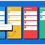
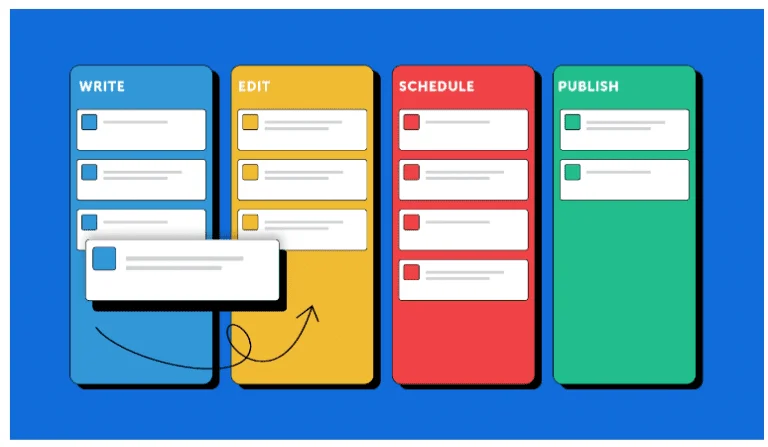
Basic empty states for first-time users are common. It mainly contains the main picture, with the main title, body, and text link to proceed with the next action. Like the youtube page, while you create a new channel.
Example of empty state
UX designers consider empty states as an afterthought process, like the example above which describes there is, “No course enrolled”. If you design it thoughtfully, it can be used in a variety of ways. As you design the empty state, ask the below questions.
- How is the view including the pages, titles, navigation without displaying the content?
- Is your user-guided as he reaches the empty state?
- Can you display other useful content during an empty state condition?
- Can this situation be engaging and helpful?
As you design and explore the options, ensure the most appropriate content is displayed on each space.
When to use empty state?
No matter what thewhat is the reasons for the empty state are, they need different treatments. A balance between the situation and content is necessary. More content does not mean that it’s a better solution as it leads to an increased cognitive cost.
There are 3 basic conditions when the users could see the empty state,
- No data is added in the grid as the user is a first-time user.
- Empty state after users actions like empty search results etc.
- Empty states while managing errors.
How to use the empty state to communicate?
Empty states confuse users concerning the working of the system. An empty panel or screen after an action would bring a myriad of questions regarding,
- The processing of the request?
- The reason for its delay in loading?
- An error occurred that is not reported to users or wrong parameter input?
In such cases, refresh the same query before they are confident enough of the empty state. In such cases, a brief message of no records found can be displayed to assure the user about the processed request and its results.
Blank state of youtube
A common scenario is encountered when the message is displayed with the system status message of “No records” but in meantime, the system replaces the inaccurate message with the queried items.
Provide learning cues:
Learning clues are necessary for beginners to help them understand how to use the application. This approach is the best help that acts like tutorials, involving users plus it’s an in-context help and more memorable due to users involvement.
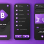
The empty state provides an opportunity to offer relevant contextual help. Such messages are called pull revelations, as they show up during user interactions. For example, the view of Power BI shows the empty-state with a description of, How to add the content here?
Blank state of snip guiding user
Getting direct paths:
Empty states guide the users with the key tasks while they are in a particular workflow. For example, asking to send the request to view details in a particular workflow, when no records are found, instead of mentioning the accomplishment of the tasks like where to go for necessary information.
In cloud applications when the user is yet to create the data in complex features, it provides two options to either log the application with the demo data or to get users started with functionality and sometimes guide users to create the data using your guidance.
The blank state of Upwork
Take Away:
Considered as an afterthought in the UX design, empty-statedesign empty-state design is an opportunity for the designers to show their communicative and helping skills during their designs. It can be used to create humourhumor doing the tasks, or increase users’ confidence as users adjust to your system for key tasks.
- All the empty state scenarios can’tcant fit into a single situation, as the situation changes, designers must think of guiding the users.
- Application with defaulted empty states creates confused users wondering if the error occurred in the system.
- As the data is absent, useabsent use an empty state to guide and provide clues to users, with the helpa help of a demo to a simple title.
- Allow the users to start with direct path links that can be provided with empty states.
- Simple progress indicators can be used while the process is running that increase visibility of the system.
- Sometimes system data cannot be avoided in such cases, display the system data and also guide them to take the next steps for better results.
To summarisesummarize, the main functions of empty states are to teach, delight, or drive them during their interactions with your system. So you retain your users and create the best impression on them.