We have seen why form designing is significant and its implications on business. We have also seen the most critical aspects of form designing in our previous article. Let’s look into the nitty-gritty of form designing – The Linchpin of Interactions. Here, we will concentrate on the practical knowledge for designing forms.
Discover available templates of Mocky for confluence to make it easier.
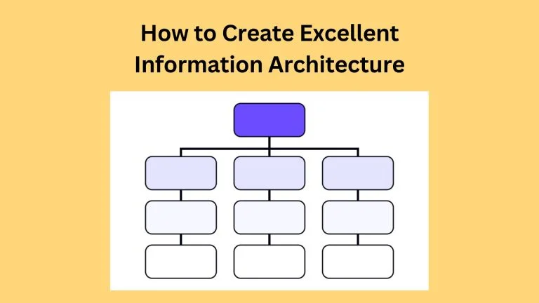
How to organize and present your question:
A form with 2-3 fields does not need grouping, but for long forms, grouping the fields manages the content for the users. For the screen readers, you can use the <fieldset> markup element, and for the user who can read, make the visual groups differentiate questions and presentations.
The ways of making groups are,
- Placement:
Placement is a straightforward way of showing groups in the field types. Even a slight placement change makes a big difference in the form structure. Move fields that go together closer than fields that don’t go together.
- Lines:
Lines in the form act as a divider, separating one group from another. Too many lines will ruin the purpose of the grouping.
- Backgrounds:
A similar background color or texture ensures the groups are different and align with the groups.
- Typography:
The font size, font width, color, and line lengths present the overall look of the form effectively.
- Don’t break the pattern:
Users rapidly learn new patterns found in the forms. Once you have a visual style, don’t break the pattern unless the form demands it.
Grouping:
Avoid hiding the content in grouping devices. As I expect the form to collect some data, the user observes each content of the form. Visually divided form divides the content into two groups, but the content grouped in a similar style can confuse users. Group the related question by placing lines for users to identify the difference between groups.
Logical Flow/ Order:
Forms are a way to converse with users, as they fill in the details. Think about it as real human conversation. The conversation of forms comes from the questions it asks, any instructions, and the arrangement of forms into different topics. The flow occurs through the format of the questions and their arrangement in the form.
Alignment:
Even though the right alignment makes a form look good, the most preferred alignment for labels and the text box is the left alignment.
If a form demands personal data, the user may not be comfortable providing his details, here the left alignments of labels make it easy for him to scan the details he needs to fill in. If your user is comfortable in providing the details, then the alignment should not be a problem for him.
Take special consideration if your form gets translated. Here, a design adapts the changing lengths of labels and fields with drop-downs. Many designers place the labels above the field, so when the form expands and contracts according to the languages, the user experiences consistent form alignment and design.
Conditional logic:
As a part of responsive design, the smart and reactive are used for user input. For example, if the user selects the yes option for the questions related to a higher degree, only then do the fields related to the higher degree appear to the user. Conditional questions make the form like and increase the space when not needed.
Multiple pages:
A human can easily switch the spoken conversation from one topic to another with a natural flow. The confusion of a topic doesn’t arise in spoken conversations, as a topic repeats itself while communicating.
But asking for clarification when the conversation is pre-defined, as mentioned in the forms. So we have to think about the flow and handling errors.
Here are exceptional tips to deal with:
- Break up long-form by the topic.
- Divide the form
- Keep on the topic at a time.
Each step should cover one particular topic, so the user can focus on it,
- Reduces cognitive load
- Supports error handling
Navigation
The tab is a way for segmenting websites into different areas that won’t work well in forms. There are two problems,
- The user overlooks the tab.
- The user loses control over the tabs.
Nowadays, you hardly observe the tabs as a data segmenter. So the best is to avoid the tabs while navigating or form filling. Don’t confuse the users by removing the secondary option (if possible), avoid tabs, and reset the form. It’s best to give control to the users and use the navigation clicks to ensure the flow of the data.
Guide and inform users:
Often, a single topic can be as big as two or more topics. It’s okay to split across separate pages, but don’t split the flow of the topic. UX designers can use the gateway screens only to describe, warn users about the external sources, and warn users of the equipment. Shares the average time to complete the form, summarizing legal considerations, etc. If possible, have a single gateway screen on a website.
You can also use progress indicators, inform the information they need to have while filling out the form, and estimate the completion time. The progress indicator informs the user about the completed and remaining steps required to fill out the form.
There are multiple ways to show the progress. Give your user the endowed progress effect by showing them the completed status. This increases the likelihood of completion. You can show the user’s location by a small pin or by showing which steps are the user now, the name of each step, the sign, the next, and previous steps. Gradual engagement of users is necessary to show the user’s milestone submissions.
Nutshell
This article of forms focuses on the presentation and organization of your form. The logical flow, grouping, conditional logic for multiple pages, and the dos and don’ts as the form develops. The next article will focus on the field types and text.