
You design better when you understand human interaction. It’s hard to influence the response rate or pursue your users to answer your questions. There are three rules to drive from social exchange theory. The idea is users will only respond to your form when they feel good about it. Here are three things to do, so your user responds to your form-filling request.
3 Things need to do to user responds to your form
-
Establish trust:
People respond to the questions if they trust the organization that asks for their personal information. If you lack user trust, the users will lie or drop out of filling the form.
-
Reduce social costs:
Reduce bad feelings of being made to feel inferior or being put at a disadvantage.
-
Increase rewards:
Reward when you feel like it, as people will do it more when you reward them by doing so.
A small immediate incentive or reward is an effective way to make users fill the forms.
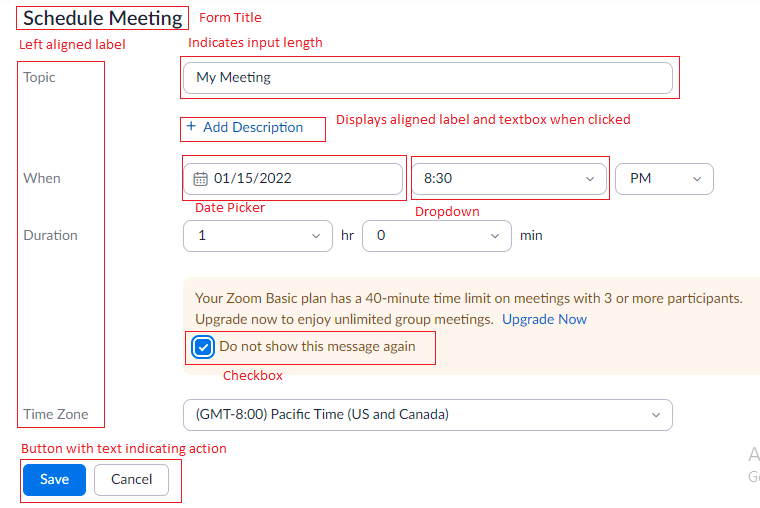
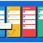
Example of form used to create a zoom meet
Let’s start with the field types. Three basic field types are text boxes, radio button, or a checkbox.
-
Text field / text box:
We never pay attention to the length of the text box, but the length of the text box acts as an affordance. Always match the size or length of the input, so users can see the full entry of their input. Sometimes there are complex versions shown below.
-
Radio buttons:
Radio buttons choose an exact element of the mutually exclusive options. Keep them vertically stacked to help the scannability of your user.
-
Checkbox:
Used to choose multiple options at a time, it gives the users an option to choose, instead of them typing the text in the form.
We can replace the above basic field type with additional field types:
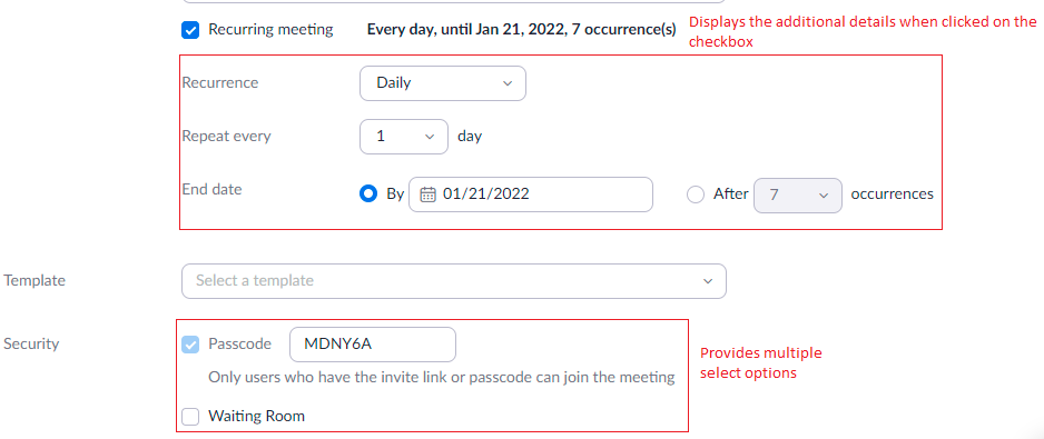
Example of multiple field types
-
Dropdown:
UX designers need to know when to use the field types. If there are over 15-20 options, text drop-downs are auto-complete or predictive search. In case there are only a few options using radio buttons.
-
Switch/Toggle:
Witch toggle buttons are like two radio buttons, but if used, they save space. Segmented control is also similar to the radio buttons, but the options are arranged in a segment.
-
Slider:
Sliders are the best way to allow the change to a particular range. Along with the slider, add a text box to add the required number.
-
Stepper:
Stepper is a combination of a text box or radio button. It’s for a slight change or in combination with an input field.
-
Date picker:
The date picker is for choosing the dates. It allows the users to select the data and auto-fill the required field.
There are many input field types used in the forms, but the most used is the label. Labels show the required information the user needs to add.
Taking care of labels:
As you ask the user to fill in the details, you don’t need to write a grammatically correct statement. But be careful while you use the labels.
- Use a label for one question or one input field.
- Avoid double negative words or negative phrases.
- Separate the label and its placeholder.
- Have a question with enough information but avoid too long or ambiguous words and unfamiliar abbreviations.
- Use the familiar user terms. The terminology differs for users as per their geological location or culture. Use the known terms commonly used by your users.
- The form is like a conversation between UX designers and users. While you design, think about how your brand communicates and use the tone and voice same as your brand.
Some more design advice while you use the labels,
- Avoid using cap letters as all caps are harder to scan.
- The font size must be 16px and contrast for an easy read to your users.
- Avoid optional fields, but if you use them, distinguish these optional fields.
- Labels should be visible to the user, so he can revise everything before submitting it.
- Button text should indicate a clear action. The user should know what to expect. Let your text be descriptive.
Positioning of the labels
As you position your labels, consider the law of proximity of your objects. Users perceive objects close to one another as more related than the objects that are not arranged near, like having the label and its input field next or near to each other.
Example of floating label pattern in bootstrap
Floating label pattern:
Using floating label patterns is observed a lot in recent forms. The inner label floats over the input field as the user clicks to enter the input.
The floating labels are easily scannable and reduce the cognitive load for users, so they don’t remember what needs to be typed. But the concern always remains that the user may skip the field filled with a label.
The most likely position for labels is at the top. Although it depends on the user, what is the best choice? Top aligned processes are processed faster, compared to the left or right-aligned labels. Using the top-left-aligned label is the best choice. Sometimes you would like your user to be slower and careful while filling government forms.
If your form is being viewed in the mobile or tab, viewport size should also be on mobile devices.
Good defaults:
We have completed the requirements for creating forms. Our primary goal is to create a form that works and does not discourage users while they fill it, but remember, these good defaults while you create a form,
- Avoid dark patterns:
Using dark patterns may discourage the user from providing accurate details. Once you lose trust, the user may not fill in the details.
- Use smart defaults:
Use the defaults that are known to the users, for example using “country” instead of geolocation.
- Prefill for returning users:
Make it easy for users to fill the remaining or defaults. Like, selecting the country’s name or the user address and email-id.
- Use defaults used to all users:
Use the defaults used to all of your users, like adults.
- Don’t annoy your users:
Even though you select some pre-selected fields, don’t annoy your, for example, pre-selecting the gender.
- Be careful:
If there are multiple fields of similar font and looks, users may skip the field.
Nutshell:
The forms are an important part of the conversation between UX and designers. In this series, we have covered the importance of form designing, how the form affects the business, how to write and design labels, and good defaults to represent the best forms for your business.
Discover how Mocky help design your form better in Jira and Confluence.