Confluence has become an indispensable tool for teams aiming to document, share, and collaborate on projects. Beyond its rich text features, the Confluence interactive diagram has stood out as a powerful tool to visualize and communicate complex information.
In this article, we will engage in the world of interactive diagrams in Confluence. Not only that, we will also show you insights on best practices and advanced techniques to make the most use of them.
Table of Contents
Understanding Confluence interactive diagrams
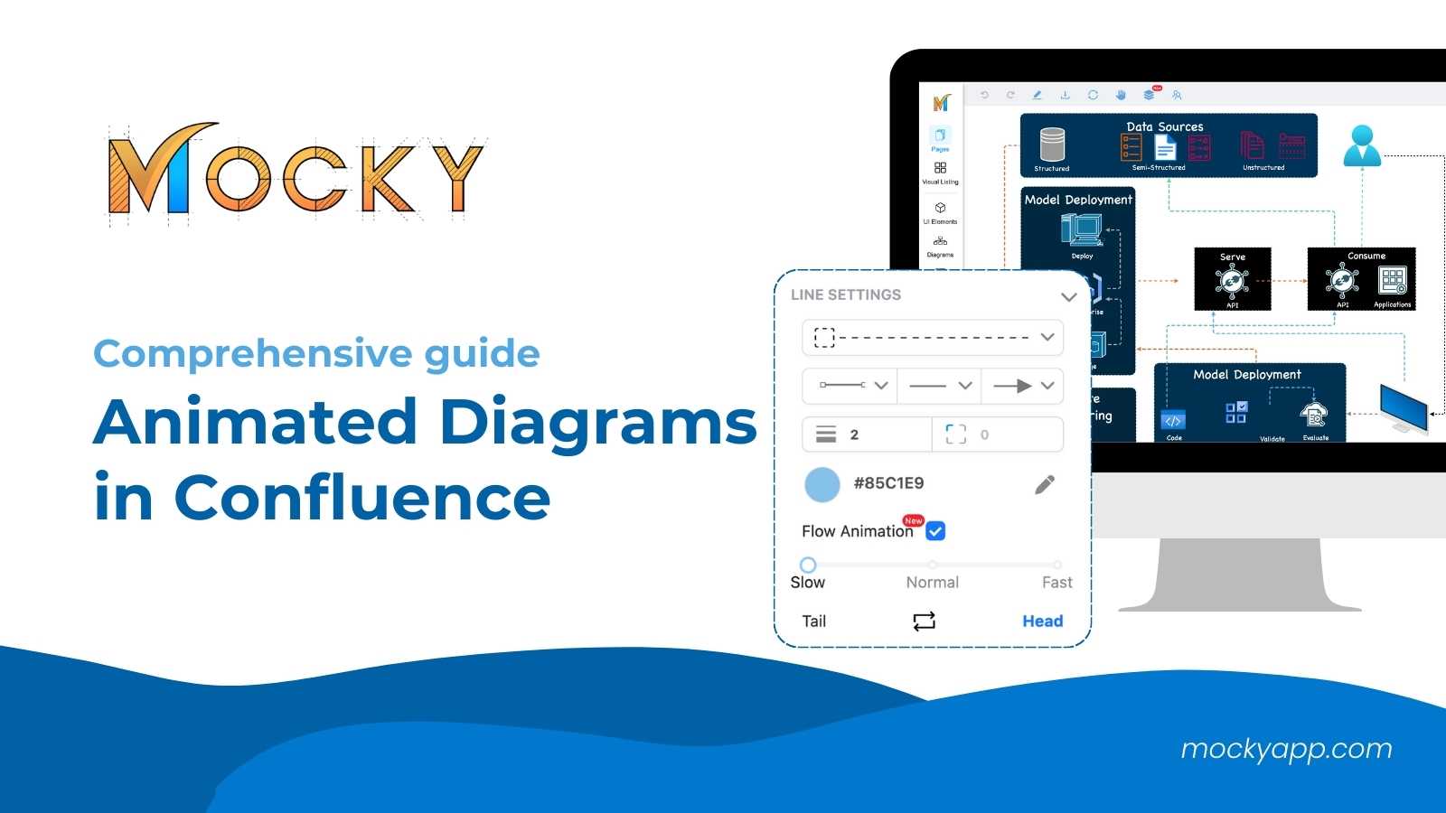
A Confluence interactive diagram is a dynamic visual representation that can embed data, link to resources, and provide detailed insights on hover or click. They merge the clarity of visual aids with the dynamic nature of interactive tools, making complex data and processes easier to understand and engage with.
1. Key features of a Confluence interactive diagram
Let’s dive deeper into the features of Confluence interactive diagrams. No matter what types of diagrams you’re working on, an interactive diagram in Confluence will have most of these key features:
- Dynamic interaction: This is the core feature that sets them apart from static visuals. Users can click on parts of the diagram to reveal more information, expand sections, or even navigate to linked Confluence pages or external resources.
- Embedding data: Interactive diagrams can embed live data from other sources. This means if you’re visualizing a dataset or a project timeline, for instance, it can update in real time as the underlying data changes.
- Integration with other Atlassian tools: Diagrams can link directly to Jira tickets, Trello boards, or other tools in the Atlassian suite. This can provide a visual representation of project status, task dependencies, and more.
- Annotations: Similar to comments in a document, annotations in interactive diagrams allow for clarifying notes or additional information to be added without cluttering the main visual.
- Collaborative editing: Multiple users can work on and refine the diagram, much like a shared document. This fosters collective input and ensures the diagram remains accurate and up-to-date.
- Version history: Like other Confluence content, interactive diagrams have version histories. This allows teams to track changes over time or revert to a previous version if necessary.
2. Benefits of using interactive diagrams in Confluence
Needless to say,
- Enhanced engagement: The interactive nature ensures that viewers are actively engaging with the content, leading to better comprehension and retention.
- Space efficiency: Instead of having multiple static diagrams or pages of text, a single interactive diagram can encompass vast amounts of data and information in an organized manner.
- Real-time data visualization: For processes or data that change over time, interactive diagrams ensure that viewers are always seeing the most current representation.
- Fosters collaboration: Teams can collaboratively build, refine, and use the diagrams, promoting shared understanding and alignment.
Basic principles of effective diagramming
Now that you have a better understanding of what a Confluence interactive diagram is, we can move on to its principles. These are the basics that you should not overlook for an effective diagramming experience.
- Clarity over complexity: A well-crafted diagram should prioritize simplicity. Avoid overloading your visuals; instead, strive for clarity to convey your message effectively.
- Significance of color coding: Colors can serve as an immediate visual cue. Consistent color coding can quickly signify categories, priorities, or stages.
- Balancing details: While details are essential, ensure your diagram also offers a high-level view to cater to all audience types.
Best practices for a Confluence interactive diagram
1. Start with a clear objective
Every successful diagram begins with a well-defined purpose. Before diving into the design process, it is crucial to understand the primary goal of your diagram.
Is it to explain a complex process, showcase a workflow, or visualize data relationships?

Additionally, identifying the target audience is crucial. Knowing whether your diagram is intended for technical experts, stakeholders, or new team members can guide its complexity and depth.
Besides, tailoring the diagram to their needs ensures that the message is both clear and relevant.
2. Optimize for Collaboration
Confluence, after all, is a collaboration tool. To fully harness its capabilities, you should set appropriate permissions for team members.
Besides, you should also determine who should have access to view, edit, or comment on the diagram, ensuring that the right people have the right access.
Collaboration isn’t just about sharing; it’s also about refining. Therefore, you can encourage team members to provide feedback and suggestions as collective insights can enhance the diagram’s accuracy and effectiveness.
3. Maintaining diagram consistency
Consistency is a cornerstone of effective communication. For diagrams, this means using consistent symbols, legends, and design elements across all visual representations.
When team members or stakeholders view different diagrams over time, this standardization ensures they aren’t spending time deciphering symbols or formats. Instead, they can immediately understand and interpret the information presented, fostering alignment and clarity.
4. Prioritizing clarity over complexity
While the temptation to include every minute detail in a diagram can be strong, it’s essential to prioritize clarity. Diagrams should provide a hierarchical structure, spotlighting the most critical information at top levels.
As a result, this allows viewers to grasp the main ideas quickly. For those needing more in-depth information, consider using drill-down features or links to more detailed resources. This tiered approach ensures that the diagram remains accessible to all audience types without overwhelming them.
5. Use interactive features responsively
Interactive features are what set Confluence diagrams apart from static visuals. Elements like drill-downs, pop-ups, and external links can enrich a viewer’s experience.
However, they should be used judiciously. It’s crucial to strike a balance where these features enhance understanding without becoming distractions or sources of confusion.
Besides the above, you can also visit our article for more interesting practices in using diagrams in Confluence.
Advanced techniques for enhanced interactivity
And of course, there are techniques you can use to create interactive diagrams in Confluence. Whether it is advanced or not, you can always leverage them for enhanced interactivity.
- Leverage the Confluence macros: Confluence offers macros that can inject dynamic content into diagrams, providing real-time data or dynamic visualizations.
- Embed external data: Integrate live feeds or data sources to keep diagrams updated automatically.
- Integration with other Atlassian tools: Syncing with tools like Jira can provide a seamless experience, linking tasks, tickets, or sprints directly within your diagrams.
3 common mistakes to avoid when using a Confluence interactive diagram

1. Overloading with information
One of the primary pitfalls teams encounter is the urge to include every single piece of information within a single diagram. While it might seem like a comprehensive approach, this can quickly lead to cluttered, confusing visuals.
An effective diagram should prioritize clarity and simplicity. It’s crucial to strike a balance between providing essential information and maintaining readability.
2. Neglecting mobile optimization
In today’s digital landscape, many users access Confluence on mobile devices. So, ignoring mobile optimization can result in diagrams that appear distorted, truncated, or entirely unusable on smaller screens.
That’s why ensuring your diagrams are responsive and legible across devices is not just a nicety but a necessity.
3. Failing to update and maintain
Interactive diagrams, especially those linked to real-time data, are not set-it-and-forget-it tools. They require regular updates to remain accurate and relevant.
Outdated or inaccurate diagrams can mislead viewers, leading to misinformed decisions or strategies.
Conclusion
A Confluence interactive diagram is a powerful tool in the modern collaborative workspace. When designed with care, attention, and best practices in mind, they can transform complex data into understandable, engaging, and actionable visuals.
We hope this article has brought you a helpful and comprehensive understanding of Confluence interactive diagrams. Besides, you can always follow the above practices and techniques for effective interactive diagrams.
In case you are looking for a powerful solution for creating wireframes, mockups, diagrams, and more, don’t forget to check out Mocky. It is available for both Confluence and Jira.


