Have you unwillingly paid for any subscription? Yes! Don’t assume it is a mistake. The designers planned it for you.
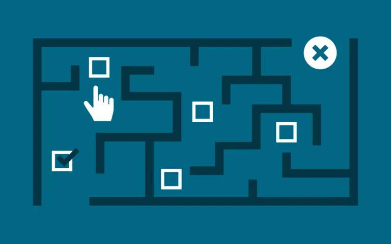
Welcome to the dark patterns!
Unlike other patterns used to create a smooth flow of products, dark patterns make the users do things they do not mean. There is a fine line between influencing users, behavior and tricking them! These trick users to do things the user did not intend to do.
These are definite patterns in the UX for someone looking for short-term results, thus using dark patterns has a negative impact in the long term.
Websites use dark patterns, known as guard patterns, to trick the user into performing a certain action. The thoughtfully designed are perceivable and hard to detect. Let’s walk through some examples of dark patterns,
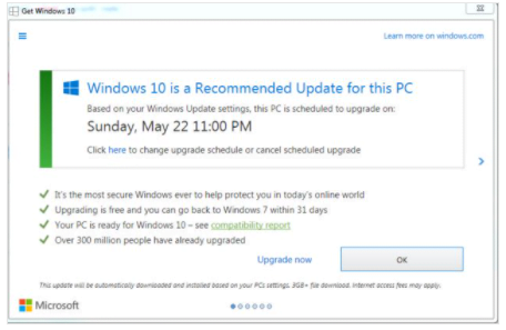
1) Bait-and-switch:
When a user takes the correct action, such as a closing pop-up expecting to cancel the download, the website does the opposite.
Here user clicks on ‘X’, on the top right, expecting it would stop the download. However, it jump-starts the download process as opposed to canceling the download.
2) Forced disclosure:
Forced disclosure is when a website makes you enter sensitive information, such as your credit card name, address, or any personal information in exchange for a free or near-free service.
3) Roach motel:
A roach motel is when a company makes it extremely difficult to get out of a situation. For example, asking users to call a customer service number to opt-out of email communications. In this example, call a number between certain hours to unsubscribe, or a long process to cancel an Amazon prime membership.
3) Forced continuity:
Force continuity is when you sign up for a free trial of service, and at the end of the trial, they charge your credit card.
4) Friend spam:
In 2015, LinkedIn lost a thirteen million dollar lawsuit related to friend spam. LinkedIn used to ask you to strengthen your network by inviting your entire book of contacts to LinkedIn via email. It pre-checked all of your contacts and would send an invitation from your email. If you click the “Add to your network” button, you give LinkedIn permission to spam every person you’ve ever emailed.
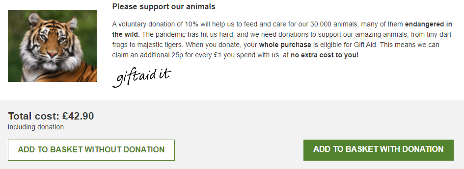
5) Deliberate Misdirection:
Misdirection attempts to focus your attention on distracting stimuli London Zoo is a great example. They highlight the green button as it’s the next step in the checkout process with a donation. The blue less conspicuous button is how you can move through the checkout process.
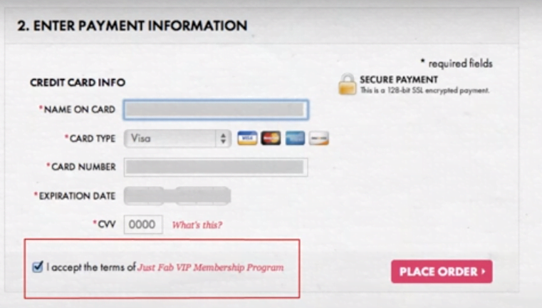
For this online shoe company, you think you’re checking out as a regular member, but they auto-enroll you in a VIP membership that costs upwards of $40. The checkout, as a regular member, is in a tiny text.
The next screen is for entering your credit card. You think you’re checking the terms and conditions box, but you’re accepting the terms of the VIP program sneak into the basket. A company will add extra items to your cart by using the opt-out radio button or checkbox on the prior page.
6) Sneak into the basket:
Sneaking into the basket is the way to add additional items to your cart.
In this example of a dialog, if you want a free item, but in the fine print, it says plus 1 euro for packaging.
Another great example of this is Ryanair. They will automatically enroll you in insurance, and you’ll have to select “don’t insure me” hidden in the alphabetized. Also, check out the purchase for Godaddy.com or Grammerly.com where they auto-select the yearly subscription for you.
5) Confirm shaming:
Confirm shaming is when a website gilts you into opting for something. For example, in a newsletter in this example, the company is shaming you by saying no; “I don’t want more knowledge”, so they make you feel as though you have to subscribe to their email service.
Since you’re missing out on getting smarter.
6) Disguise advertising:
Disguise advertising is when companies run advertisements that look like a download button, tricking users into clicking on the ads.
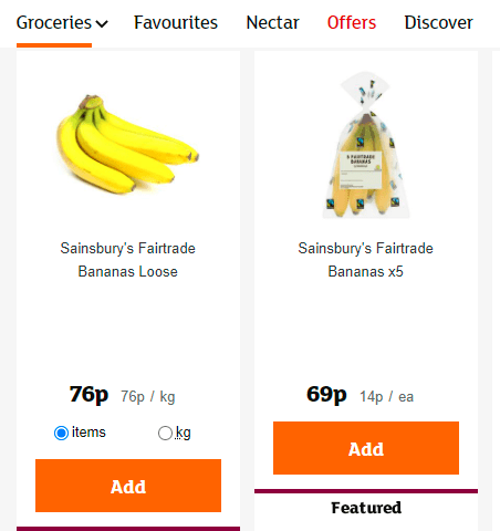
7) Preventative price comparison:
Preventative price comparison is when companies don’t want the user to compare two items or figure out the price of one unit in a bundle. In this example, you can’t compare the two bags of apples because it doesn’t show you the price of one unit.
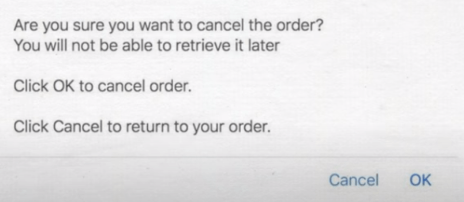
8) Bad Language:
In this example, you’re extremely confused by what action to take, to cancel your order since the cancel button is essentially saying cancel your cancel order’ it’s important to double-check your product or website to ensure that you’re free of dark patterns. These dark patterns stress your customer, and you don’t want that to happen.
9) Privacy Zuckering:
It’s referred to Facebook CEO, Mark Zuckerberg. In the initial days of Facebook, it made it difficult for the user to control their privacy settings. They share the user’s details with the data brokerage industry, as per their Terms and Conditions that the user agrees to sell his or her data. Data brokers buy data to use in insurance or loans services. This non-regulated industry acts behind the scenes.
10) Road Block:
Often seen on any site with lots of advertisements, you click on the site, and a pop-up interrupts your intended actions.
11) Confusing colors:
Using similar colors makes it difficult for the users to read or find what they want, like the unsubscribe link. A company would not like to lose users, so trick them by using similar shades and tints tough to read.
Conclusion:
UX designers should avoid using dark patterns. More clearly are your intentions, higher will be your users. Dark patterns trick users, but it also annoys them, as it leads the user to lose their time or even a financial loss not encouraged by the users.