Heuristic analysis is an inspection method of solving problems by finding ways of dealing with them by learning previous experience. UX methods solve the recurring challenges, but to increase the ROI, one must know the precise implementation of these methods. There are the three most significant usability methods for us to:
- Understand the relationship between them.
- Hints informed decisions.
- Choosing the correct ways of the design process.
Heuristic in UX tests the usability:
It is a comprehensive test status of UI conducted by 3-5 usability experts.
Heuristic reviews the product and compares it with pre-defined principles.
This method cuts obvious errors and improves the testing process before user testing.
You can find multiple rules on heuristics used in UX design. Like Jakob Nielsen’s heuristics for user interface designs., Ben’s eight golden rules, Jill’s 10 cognitive engineering principles, and many more. The widely used heuristic usability is of Jakob Nielsen’s.
10 Thumb rules for UX designs:
The explicit rules specified by Jakob’s are:
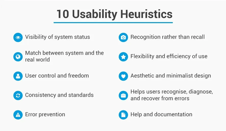
- Visibility of system status
Let your designs send communication feedback within a short or reasonable time. The open system informs the user about the system’s condition and empowers him for the later action. It is best in our interest to present the prompt action. Like visibility of persistent system status: battery life, the Wi-Fi connection indicator, or feedback after an appropriate user’s actions.
This heuristic makes the user confident of the system accepting their requests. It is not essential to add every system update unnecessary for the user. A lot of information can distract users, so try to focus on the key information for users. Thus you enable open and continuous communication, bridging communication gaps, and driving the system’s reliability to the user.
- Match the system to the real world:
Follow your design concepts to the real world of your users. Create a design that speaks your user’s language, words, phrases, internal jargon familiar to the users rather than system-oriented terms. Following real-world conventions ensures providing the information in logical order.
- User controls and freedom:
Allow the users to undo or leave the unwanted actions in quick steps or just by quitting what they were doing. Users may undertake unwanted actions and would like to leave that state by taking a clear exit, so you have to support undo, redo, or only undo.
For example, a browser’s back button to reverse the process, or a clear button in a form.
If the user knows the feature and the steps, they feel control over the system. Since the user can back from an unwanted click, it speeds their freedom enhances trust in the application.
- Consistency and standards:
Consistent UX design follows the conventions given by the platform or the organization. Users will not wonder about the actions of different words, statements, or situations. Try to design a predictable UI with internal and external consistency. If you have a family of products, maintain the setting consistency of each product to avoid overlapping with the user’s understanding.
- Error prevention:
Design to eliminate the problem that is likely to occur by slips and mistakes by displaying friendly error messages.
For example, the user accidentally clicks on the reply all button instead of replying to a sender. We can prevent this by designing a message or informing users about their decision.
- Recognition rather than recall:
Don’t overload the user by asking him to remember his past choices or actions. Make visible the elements, actions, or options.
- Flexibility and efficiency of use :
Allows shortcuts so experts can use them efficiently as compared to novice users. Designs can allow tailoring frequent actions, personalization, and customizations.
- Aesthetic and minimalist design:
Avoid irrelevant information not needed for the user. It improves their visibility, ensuring support for users’ primary goals.
- Recognizes, diagnose and recover from errors:
A plain language for error messages shows the problems and required solutions.
- Help and documentation:
The best system is when users don’t need an explanation, but in case it requires, you can provide documentation to complete the user’s tasks.
Although there are many heuristics-based factors for usability problems, below are unchanged ten factors, since 1994.
- Applying the usability guidelines:
UX designing is more than adding guidelines, but the community has contributed significantly to promoting consistency and good practice among designers.
There are 247 web usability guidelines specified in the below categories
- Home page usability:
- Task orientation
- Navigation and IA
- Forms and data entry
- Trust and credibility:
- Writing and content quality
- Page layout and visual design
- Search usability
- Help, feedback, and error tolerance
These guidelines are contextually specific, so they use these guidelines when appropriate. Although these guidelines are optimized for the desktop, you can create your list using the above guidelines for your apps or mobile solution.
Heuristic evaluation:
In heuristic evaluation, we compare the interface with accepted usability principles. This analysis results in potential usability issues.
Advantages of heuristics:
Heuristics are not to be confused with usability testing. A site or app needs evaluation for both tests.
- It provides quick and inexpensive feedback to designers at the early stage of the designing phase.
- The correct heuristic suggests the best measures for designers.
- We used these methods with other usability testing methods and further potential issues.
Disadvantages:
A team of 2-5 members usually drive heuristics methods, or under some circumstances, a single person also conducted it.
- Applying heuristics requires knowledge and experience.
- Requires multiple trained 3-5 experts to get the aggregated results.
- It reveals various issues, but to identify the most critical issues, consider usability testing.
Cognitive walkthrough and heuristic analysis:
Many designers interrelated the cognitive walkthrough and heuristic analysis. Cognitive walkthrough is a task-focused heuristic analysis method, where 1 or 2 experts walk through the tasks and counter-check these tasks of users’ learning ability by accomplishing the task.
Nutshell:
The heuristic analysis will allow the users to get out of unwanted tasks. So while you analyze the happy path, you can ask the questions like,
- Will the user achieve the right outcome?
- Will users implement the correct options available to them?
- Will they associate a correct action with the right choice?
- Will the user make the required progress towards its outcome?