Jira, Atlassian’s popular issue and project tracking software, offers a plethora of visualization tools for project management. One of the most insightful tools for teams practicing Agile and Kanban methodologies is the Jira cumulative flow diagram (or CFD).
In this article, we’ll dive into the essence, components, benefits, and interpretation of the Cumulative Flow Diagram in Jira.
What is a Cumulative Flow Diagram?
To better understand how a cumulative flow diagram works, you will have to understand its basic components. These components include:
- Areas or Bands: Each colored band in the CFD represents a different status or column from the board (like To Do, In Progress, Done). The thickness of the band indicates the number of items in that status at a given time.
- Dates: represents the horizontal axis. This helps teams understand the flow of work over time.
- Work Items: showcases as the vertical axis, representing the cumulative count of work items.
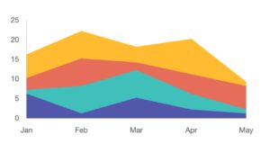
In short, a cumulative flow diagram showcases the status of tasks or stories over time. Additionally, it provides a visual representation of work items as they move through various states in the workflow. The CFD’s horizontal axis represents time (usually days), and the vertical axis shows the cumulative number of work items.
Benefits when using Jira cumulative flow diagram
1. Transparency and communication
A cumulative flow diagram in Jira provides stakeholders with a holistic view of the project’s progress, eliminating the need for frequent progress checks or status meetings.
Besides, it can also offer communication among stakeholders, allowing everyone to visualize the same data. Therefore, CFD provides a unified understanding of where the project stands and what challenges lie ahead.
2. Enhanced decision making
With solid data from the cumulative flow diagram, teams can make more informed and data-driven decisions, sidestepping the pitfalls of intuition-based choices. Moreover, it also enables effective resource reallocation by highlighting areas of bottleneck or stagnation.
All to ensure that effort and manpower are directed where they are most needed.
3. Continuous improvement
The continuous feedback mechanism of the Jira cumulative flow diagram promotes an iterative approach to improvement. As teams make changes to processes, they can observe the direct impact on the workflow, ensuring that strategies evolve in response to real-world challenges.
Additionally, the diagram can hint at quality concerns if issues accumulate in specific stages like testing or review.
4. Risk management
A cumulative flow diagram serves as an early warning system, allowing teams to anticipate potential delays and act before they escalate into critical problems. Furthermore, any unexpected increase in the backlog or “To Do” bands can signal scope changes or feature creeps, enabling teams to address them promptly.
5. Stakeholder engagement
The visual nature of this type of diagram provides stakeholders with clear insights, helping to set realistic delivery expectations. By regularly sharing the flow diagram with stakeholders, teams can foster trust, underlining their commitment to transparency and showcasing their proactive approach to challenges.
6. Enhanced collaboration
Acting as a central reference point, the Jira cumulative flow diagram facilitates alignment and coordination across multiple departments involved in a project. When the diagram highlights areas of concern, it can catalyze team-wide problem-solving sessions, strengthening team unity and collaborative spirit.
7. Optimized workload
By spotlighting imbalances in work distribution across different phases, the cumulative flow diagram in Jira empowers teams to recalibrate tasks for a more even distribution. Additionally, by emphasizing the completion of in-progress items, the diagram helps teams reduce the inefficiencies that come with juggling multiple tasks simultaneously.
How to interpret cumulative flow diagram
1. Understanding the bands
At the core of the cumulative flow diagram are the distinct colored bands. Each represents a different phase or status in your project, from inception to completion.
When these bands flow consistently parallel to one another, it’s indicative of a balanced workflow. The team is adding new items to the workflow and completing existing items at approximately the same rate, creating a steady flow.
However, it’s when these bands deviate from this parallel flow that the true interpretative power of the CFD comes to light. An expanding band, for instance, signifies an accumulation of items in that particular status.
This is often the first sign of a bottleneck. If your “In Progress” band is broadening over time, it’s a clear indicator that tasks are initiated faster than they’re being completed. On the other end, a contracting band might seem positive initially, but it could mean that although items are quickly moving out of a phase, they might be piling up in the subsequent phase, hinting at another potential bottleneck.
2. Spotting stagnation
The bands’ movement can also reveal stagnation, which is often a red flag in project management. Observing horizontal stretches in any of the bands signifies that the items within that phase aren’t moving.
Such stagnation, especially in dynamic phases like “In Progress” or “Review“, suggests blockages or paused processes. It could be due to a myriad of reasons – perhaps there is a lack of necessary resources, or maybe critical feedback loops are broken.
3. Assessing lead time
Another crucial aspect of the CFD is the lead time, which represents the duration it takes for an item to traverse from the start to the end of the workflow.
By examining the width of the entire diagram at various points, teams can get a sense of how their lead time is evolving. An increasing lead time is often a cause for concern, signaling systemic delays that might need addressing.
4. Work in progress (WIP) examination
The “In Progress” band, specifically, sheds light on the work currently being tackled. Consistency in the WIP indicates stability, which is desired.
However, significant fluctuations in the WIP band suggest that there are inconsistent workloads or potential issues in task allocation. This might prompt a team to consider implementing WIP limits or reassessing task assignments.
How to create a cumulative diagram in Jira
Surely you cannot simply create a cumulative diagram in your Jira instance or add it to your Jira issues. To do that, you will need another app to help you draw and add the diagram.
Mocky for Jira will make an excellent choice for the job. With it, you can easily create a cumulative flow diagram for your project and quickly add it to your Jira issues or tickets. What makes it super convenient is that you can do it directly on your Jira instance.
No tab switching or opening a new browser is needed.
Best practices for using Jira cumulative flow diagram
1. Regular review cycles
It’s vital to make the CFD a regular part of your team’s review process. Whether during daily stand-ups, weekly meetings, or sprint retrospectives, consistently examining the CFD ensures that the team remains cognizant of any emerging bottlenecks or workflow imbalances.
This regular engagement not only keeps the team aligned with the project’s status but also helps in the proactive identification and resolution of potential issues.
2. Customization for context
Every team has a unique workflow. While Jira provides default stages, it’s essential to customize the CFD to reflect the team’s actual workflow accurately. By ensuring each phase or status in the project is represented in the CFD, teams get a more granular and precise view of how work progresses, leading to more actionable insights.
3. Set and monitor Work in Progress (WIP) Limits
One of the primary causes of bottlenecks is having too much work in a particular phase. By setting WIP limits, teams can ensure a consistent flow of work. If a particular phase consistently hits or exceeds its WIP limit, it’s an immediate signal to investigate and address the cause.
As a result, monitoring and respecting these limits can lead to smoother workflows and quicker issue resolution.
4. Foster a culture of action and adaptation
A CFD is not just a passive reporting tool; it’s a catalyst for action. Teams should be encouraged to view the CFD as a dynamic tool that calls for adaptive changes.
If a bottleneck is identified, swift action should be taken to address it. Meanwhile, if lead times are increasing, processes should be re-evaluated. The key is to instill a mindset where the insights from the CFD lead to tangible actions and continuous process improvement.
5. Engage all stakeholders
While the immediate audience for a CFD might be the project or development team, it’s beneficial to share its insights with all stakeholders, from product owners to upper management.
A well-understood cumulative flow diagram can serve as a communication bridge, ensuring everyone involved has a clear, data-backed understanding of the project’s flow. This transparency can aid in setting realistic expectations and fostering trust.
6. Combine with other metrics
While the CFD provides a wealth of information on its own, its insights can be enhanced when combined with other metrics like burndown charts, velocity charts, or lead and cycle time metrics. By correlating the data from the CFD with these other metrics, teams can get a more comprehensive understanding of their project’s health and areas of improvement.
Final thoughts
The Jira cumulative flow diagram is more than just a colorful chart. It’s a powerful tool for Agile and Kanban teams to visualize the flow of their work, identify bottlenecks, and optimize their processes.
By regularly reviewing and acting upon the insights from the CFD, teams can significantly enhance their productivity and predictability.