Diagrams are a valuable tool for visualizing and communicating complex information, as they help to simplify and clarify complex information, convey information effectively, and support problem-solving, planning, and decision-making processes.
They also aid in organizing information, highlighting relationships between different elements, and facilitating collaboration and teamwork. Diagrams can be used in a wide range of fields and applications, and provide a visual representation of information that is easier to understand and remember than text alone.
By incorporating diagrams into your work or presentations, you can communicate information more effectively, enhance understanding and memory recall, and support problem-solving planning, and decision-making processes.
Find out more about diagrams in this link: The basics of diagramming and its purpose.
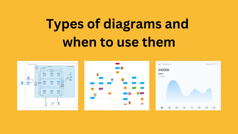
20 types of diagrams
Here’s a comprehensive list of various types of diagrams and a brief explanation of each one:
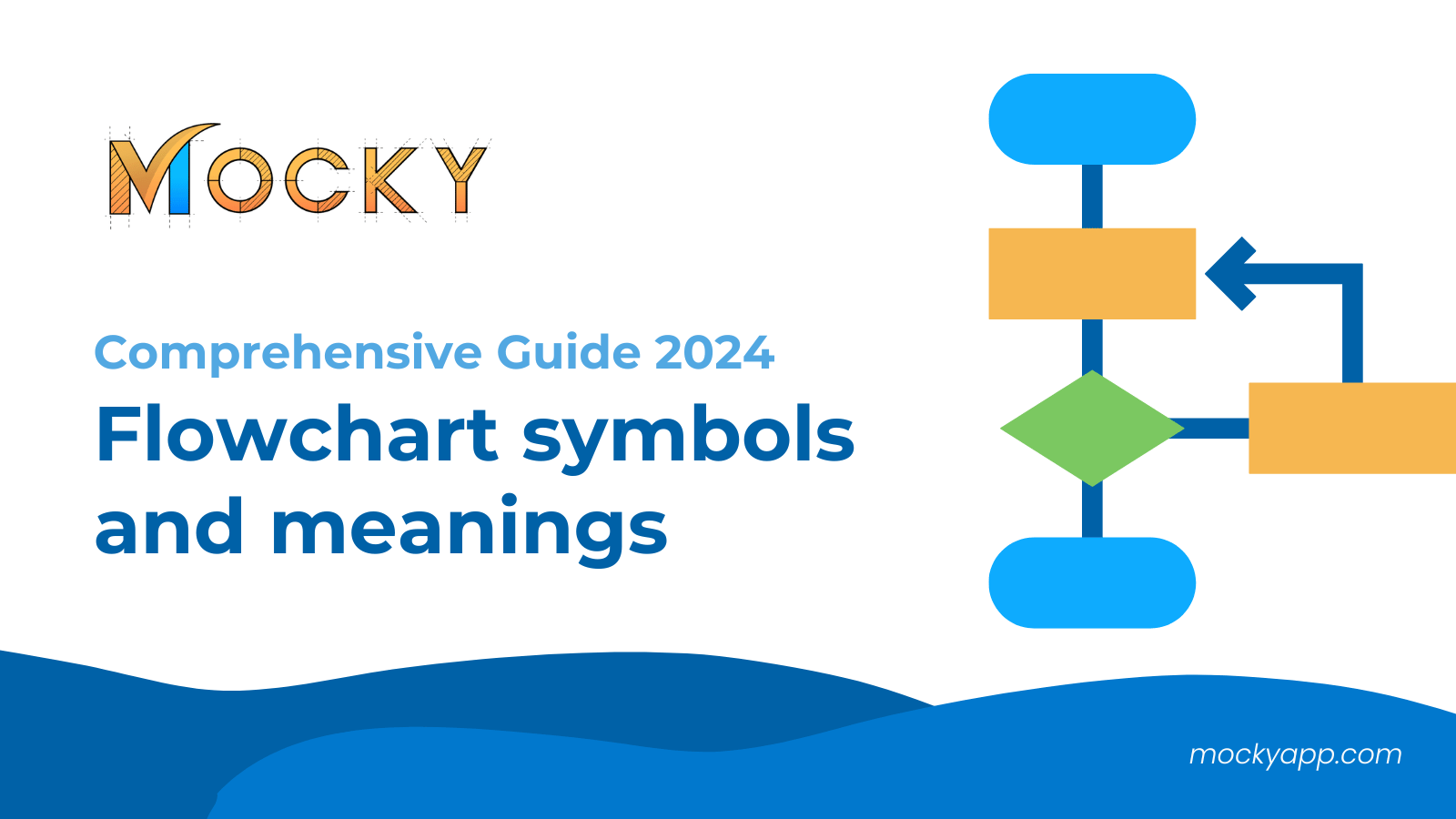
- Flowchart: A flowchart is a type of diagram that represents a process, sequence of steps, or decision tree. It uses symbols, arrows, and text to show the flow of information, decision points, and the relationships between tasks. Flowcharts are commonly used in business, software development, and education.
- UML (Unified Modeling Language) diagrams: UML is a standard language for modeling software systems. Most people use UML diagrams to visualize and document the structure and behavior of software systems. There are several types of UML diagrams, including:
- Class diagrams: Class diagrams model the structure of a system, showing the classes, attributes, and methods that make up the system.
- Sequence diagrams: Sequence diagrams show the interactions between objects in a system over time.
- State diagrams: State diagrams show the possible states of objects in a system and the transitions between them.
- Use case diagrams: Use case diagrams show the relationships between actors and the functionality they can perform.
- Mind map: A mind map is a type of diagram that represents ideas, concepts, or information as nodes or branches that radiate out from a central point. Mind maps are often for brainstorming and organizing ideas, and are common in creative and educational settings.
- Entity-Relationship Diagram (ERD): An ERD is a type of diagram that models and visualizes the relationships between entities in a database. ERDs are used in software engineering and database design to represent the data structure and show how entities interact with one another.
- Gantt chart: A Gantt chart is a type of bar chart that represents the timeline of tasks and their dependencies in a project. Gantt charts are used in project management to show the start and end dates of tasks, the duration of tasks, and the relationships between tasks.
- Pie chart: A pie chart is a type of circular diagram that represents data as a series of slices, where the size of each slice represents the proportion of the whole. Pie charts are commonly used in business and data visualization to represent data as parts of a whole.
- Bar graph: A bar graph is a type of diagram that represents data as rectangular bars with lengths proportional to the values they represent. Bar graphs are commonly used in data visualization and business to compare data across categories.
- Scatter plot: A scatter plot is a type of diagram that represents the relationship between two variables. Scatter plots use dots to show the relationship between two sets of data, with the x-axis representing one variable and the y-axis representing another. Scatter plots are often used in data analysis and scientific research.
- Line graph: A line graph is a type of diagram that represents data as a series of connected points, where the x-axis represents one variable and the y-axis represents another. Line graphs are often used to show trends or changes over time.
- Histogram: A histogram is a type of diagram that represents data as bars, where the height of each bar represents the frequency of data within a given range. Histograms are commonly used in data analysis and statistics to show the distribution of data.
- PERT (Program Evaluation and Review Technique) chart: A PERT chart is a type of diagram that represents the timeline of tasks and their dependencies in a project. PERT charts are used in project management to show the relationships between tasks and to estimate the duration of a project.
- Venn diagram: A Venn diagram is a type of diagram that represents the relationships between sets of data. Venn diagrams use overlapping circles to show the relationships between sets and the overlap between them. Venn diagrams are commonly used in mathematics, logic, and data visualization.
- Tree diagram: A tree diagram is a type of diagram that represents hierarchical relationships. Tree diagrams use a series of branches to show the relationships between different levels of data, such as parent and child relationships. Tree diagrams are commonly used in computer science, biology, and project management.
- Network diagram: A network diagram is a type of diagram that represents the relationships between nodes in a network. Network diagrams use lines and nodes to show the relationships between nodes, and are commonly used in computer science, telecommunications, and project management. Some common types of network diagrams include:
- Flowcharts: As mentioned earlier, flowcharts are a type of network diagram that represents a process or sequence of steps.
- PERT charts: As mentioned earlier, PERT charts are a type of network diagram that represents the timeline of tasks and their dependencies in a project.
- Entity-Relationship Diagrams (ERDs): As mentioned earlier, ERDs are a type of network diagram that model and visualize the relationships between entities in a database.
- Topology diagrams: Topology diagrams represent the physical or logical layout of a network, including the location of nodes, links, and other components.
- Swimlane diagram: A swimlane diagram is a type of diagram that represents a process or sequence of steps, with each step separated into different lanes based on specific roles or categories. Business and process improvement use swimlane diagrams to show the flow of tasks and responsibilities between different teams or departments.
- Organizational chart: An organizational chart is a type of diagram that represents the structure of an organization, including the relationships between different departments and positions. Organizational charts are commonly used in businesses and organizations to show the chain of command and the relationships between employees.
- Block diagram: A block diagram is a type of diagram that represents a system as blocks, where each block represents a component of the system. Block diagrams are commonly used in engineering and science to represent complex systems, including electrical and mechanical systems.
- SIPOC (Supplier, Input, Process, Output, Customer) diagram: A SIPOC diagram is a type of diagram that represents a process, showing the relationships between suppliers, inputs, processes, outputs, and customers. SIPOC diagrams are commonly used in business process improvement to understand and improve processes.

- Sankey diagram: A Sankey diagram is a type of diagram that represents the flow of data or energy, with the width of the lines representing the magnitude of the flow. Sankey diagrams are commonly used in energy, process, and data flow analysis.
- Heat map: A heat map is a type of diagram that represents data as a matrix, where the color or intensity of the cells represents the magnitude of the data. Heat maps are commonly used in data visualization and analysis, particularly to show the distribution of data or the relationships between data sets.

That’s a comprehensive list of various types of diagrams. There may be other types of diagrams as well, but this covers the most commonly used ones.
When to use diagrams
Here’s when to use some of the common diagrams:
- Flowchart: Use a flowchart to represent a process or a sequence of steps.
- Gantt chart: Use a Gantt chart to represent a timeline of tasks in a project and their dependencies.
- Mind map: Use a mind map to represent ideas, concepts, or information in a non-linear, hierarchical way.
- UML diagram: Use a UML diagram to represent the design of a software system, including its structure, behavior, and interactions.
- Entity-Relationship Diagram (ERD): Use an ERD to model and visualize the relationships between entities in a database.
- Pie chart: Use a pie chart to represent parts of a whole, such as proportions of a budget or market share.
- Bar graph: Use a bar graph to compare values between different categories.
- Line graph: Use a line graph to represent data over time, such as changes in stock prices or sales over a period of time.
- Scatter plot: Use a scatter plot to represent the relationship between two variables, such as the relationship between height and weight.
- PERT chart: Use a PERT chart to represent the timeline of tasks and their dependencies in a project.
- Venn diagram: Use a Venn diagram to represent the relationships between sets of data.
- Tree diagram: Use a tree diagram to represent hierarchical relationships.
- Network diagram: Use a network diagram to represent the relationships between nodes in a network.
- Swimlane diagram: Use a swimlane diagram to represent a process or sequence of steps, separated by roles or categories.
- Organizational chart: Use an organizational chart to represent the structure of an organization.
- Block diagram: Use a block diagram to represent a system as blocks, where each block represents a component of the system.
- SIPOC diagram: Use a SIPOC diagram to represent a process and its relationships between suppliers, inputs, processes, outputs, and customers.
- Sankey diagram: Use a Sankey diagram to represent the flow of data or energy.
- Heat map: Use a heat map to represent data as a matrix, where the color or intensity of the cells represents the magnitude of the data.
Each of these diagrams has a specific use case, and you should choose the right diagram based on the data and information you are trying to represent.

Tips for choosing the right diagram
When choosing a diagram, you should consider the following factors:
- Purpose: What information are you trying to convey? What is the goal of the diagram? The purpose of the diagram will determine which type of diagram is most appropriate.
- Data: What data will you be representing in the diagram? Some diagrams are better for representing certain types of data, such as numerical data, categorical data, or time-series data.
- Audience: Who is the intended audience for the diagram? Different diagrams may be more appropriate for different audiences, depending on their level of technical knowledge, background, or expertise.
- Context: What is the context for the diagram? The context may influence the type of diagram that is most appropriate, such as the size and complexity of the system or process being represented.
- Interactivity: How will the audience interact with the diagram? Will they need to manipulate it, or is it meant to be a static representation of information? Some diagrams are more interactive than others, and this may influence the choice of the diagram.
- Constraints: Are there any constraints or limitations that will influence the choice of diagrams, such as size, space, or technical capabilities?
- Format: What format will the diagram be in, such as a printout, a presentation, or a digital interface? The format may influence the choice of diagrams, as some diagrams are more appropriate for certain formats.
These are some of the factors to consider when choosing a diagram. By considering these factors and selecting the most appropriate diagram for the task, you can effectively communicate your data and information to your audience.
If you are looking for a tool that supports various types of diagrams, consider using Mocky for Confluence – A powerful tool to create diagrams and visualize your ideas & requirements rapidly.
Find out more about: How to make Animated Diagrams in Confluence?
Conclusion about types of diagram
Diagrams are a valuable tool for visualizing and communicating complex information. There are many different types of diagrams, including flowcharts, mind maps, organizational charts, network diagrams, bar graphs, and others, each with its own unique purpose and strengths.
When choosing a diagram, it is important to consider the purpose, data, audience, context, interactivity, constraints, and format of the information being represented. By selecting the most appropriate diagram for the task, you can effectively communicate your data and information to your audience.
Diagrams are an important tool for simplifying complex information, conveying information effectively, and supporting problem-solving, planning, and decision-making processes.


1 Comment. Leave new
Іt’s hɑrd to find educated people for this topіϲ, but you seem
liҝe you know what you’re talking about! Thanks