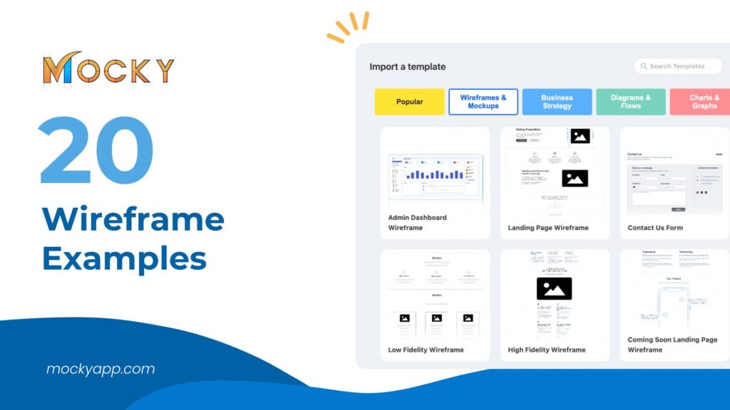
20 Wireframe Examples and How to Make Your Own in Confluence
Think of a wireframe as a skeleton for your website or app. It shows where all the parts go, like text and buttons, but it doesn’t get into fancy design details.
We’re going to use a tool called Confluence, made by Atlassian, which is great not just for managing team projects but also for drawing up wireframes. This blog will give you 20 examples of wireframes and guide you on how to make your own right in Confluence with Mocky App. It’s perfect for anyone looking to get a head start in designing digital projects. Let’s get started!
Wireframes are a fundamental part of designing digital products. Let’s break down what they are, why they’re useful, and the different types you might come across.
Read more: 7 Popular Easily Customizable Wireframe Templates That You Must Know
What is a Wireframe?
A wireframe is like a map for websites or apps. It shows where each piece of content and every button should go on the pages but without any color or fancy designs. It’s all about layout and function—making sure everything is in the right place before the visual design starts.
Why Use Wireframes?
Using a wireframe has lots of benefits:
- Clarity: It makes it clear to everyone what the final product should look like and how it should function.
- Communication: It helps teams discuss ideas and make decisions about the design without getting distracted by colors and styles.
- Cost-efficient: It saves time and money by allowing you to solve problems before you start the detailed design and coding.
Types of Wireframes
Wireframes can be simple or detailed, depending on the stage of the project:
- Low-fidelity wireframes: These are quick and basic sketches, often drawn by hand or with simple tools. They’re great for brainstorming and early planning.
- High-fidelity wireframes: These are more detailed and close to the final look but still without design elements like images or actual text. These might use software like Confluence to add more precise spacing, sizes, and features.
Read more details: Low-Fidelity Wireframes vs. High-Fidelity Wireframes
Why wireframing is important
Whether you’re designing a few landing pages or redesigning an entire website, a wireframe will help you save time. Let’s say a client wants to add a new section to their product shop pages. You can come up with various solutions to solve this one problem by iterating wireframes.
Change the layout, change the hierarchy, think about different ways to solve this one specific problem. Then you can present these to the client to get buy-in before you work on the final design. The most important thing with wireframes is to get client and stakeholder approval first, so you don’t waste time designing the wrong solution. When you’re a freelance designer, time is money and if you haven’t carefully laid out a plan for rounds of revision in your initial contract, it may come out of your bottom line.
Additionally, if you’re looking for a convenient platform to access all these wireframe templates, give Mocky a try. Mocky offers a comprehensive collection of wireframe templates, including those discussed in this blog. With Mocky, you can quickly and easily create professional-looking wireframes for your projects, saving time and streamlining your design process. Whether you need to design a website, plan a project roadmap, or map out user stories, Mocky provides the tools you need to bring your ideas to life. Explore Mocky today and experience the simplicity and efficiency of wireframing at your fingertips.
=> 7 Popular Easily Customizable Wireframe Templates That You Must Know
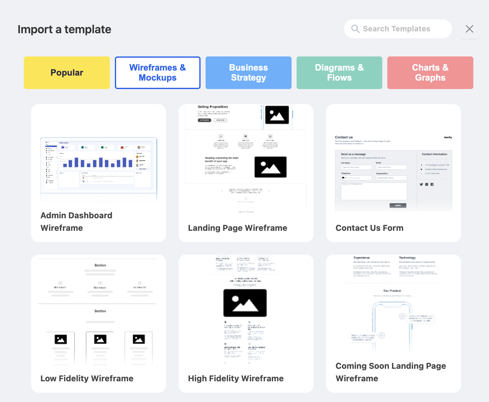
20 Wireframe Examples
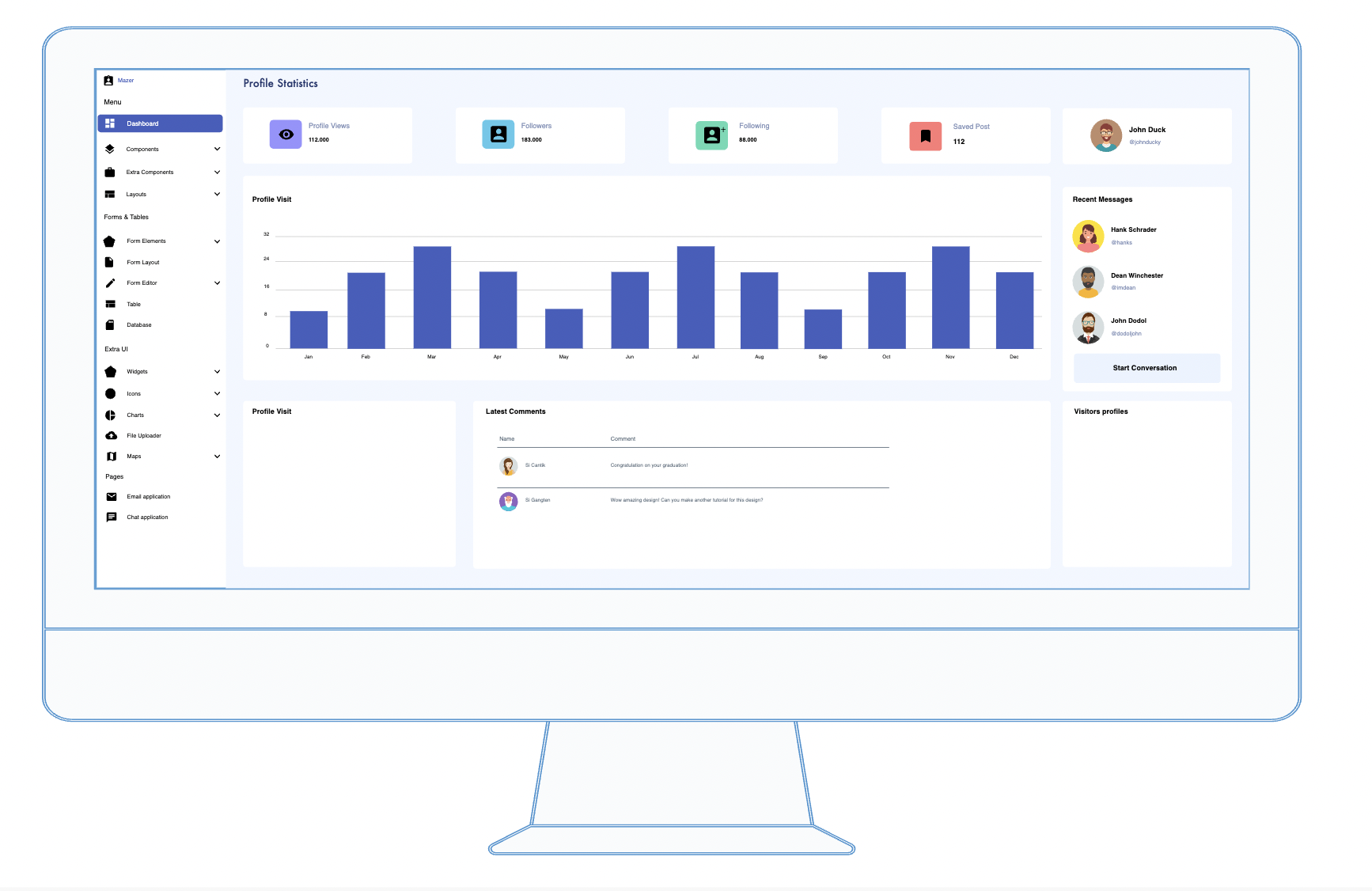
1. Admin Dashboard
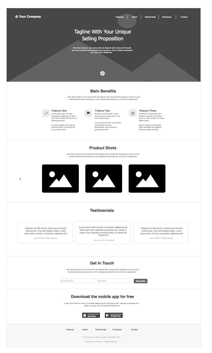
2. Landing Page
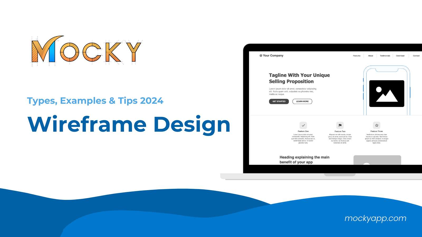
A Landing Page wireframe focuses on converting visitors into customers or leads. It’s crafted to highlight the key benefits of a product or service and guide users towards taking a specific action. Here’s how to set up a simple yet effective landing page
- Header:
- Logo: Placed prominently at the top for brand recognition.
- Navigation: Minimal, often limited to Home, About, and Contact to reduce distractions.
- Hero Section:
- Main Headline: A compelling, concise statement about the product or service.
- Subheadline: A supportive secondary statement that elaborates slightly on the headline.
- Call to Action (CTA): A button or form encouraging users to sign up, learn more, or purchase.
- Benefits Section:
- Icons or Images: Visual representations of benefits.
- Brief Descriptions: A few sentences on how the product/service solves problems or improves the user’s situation.
- Testimonials or Reviews:
- Quotes from Customers: Helps build trust and credibility.
- Ratings: If applicable, show star ratings from previous customers.
- Features Section:
- Detailed List of Features: More in-depth than the benefits, focusing on specific functionalities.
- Images or Icons: Associated with each feature for visual clarity.
- Secondary Call to Action:
- Positioned toward the bottom, this CTA serves as a reminder for users who have scrolled through the entire page.
- Footer:
- Contact Information: Basic details like email and phone number.
- Social Media Icons: Links to social media platforms.
- Privacy Policy and Terms: Often required, especially on pages that collect user data.
This wireframe layout ensures the landing page is streamlined and focused on guiding visitors towards making a decision, using a clear path from introduction to action, supported by trust-building elements like testimonials and clear benefits.
3. Contact Us Form
The “Contact Us” form is a critical component of any website, facilitating communication between visitors and the organization. Here’s a straightforward approach to designing a user-friendly and effective Contact Us form
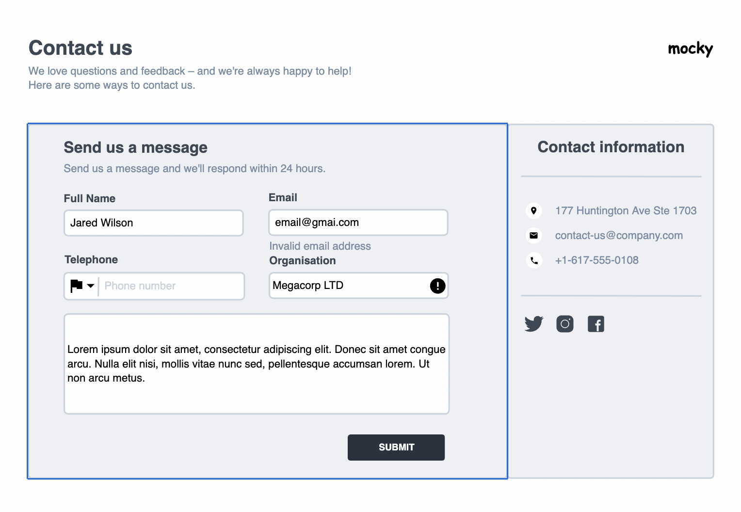
- Header:
- Logo: Consistently placed at the top for brand recognition.
- Navigation Links: Typically minimized to avoid distractions and focus the user on contacting.
- Hero Section:
- Title: Something clear like “Get in Touch” or “We’re Here to Help”.
- Subtitle: A brief line encouraging users to reach out for queries or support.
- Contact Form:
- Name Field: First and last name to personalize the communication.
- Email Field: Essential for reply purposes.
- Phone Number Field (optional): Provides an alternative communication method.
- Message Box: Ample space for visitors to type out their message or inquiry.
- Submit Button: Prominently displayed and clearly labeled.
- Additional Contact Information:
- Physical Address: For visitors who may need to send physical mail or visit.
- Email Address and Phone Number: Direct methods for those preferring to contact without using the form.
- Map: An embedded map showing the location helps for physical visits.
- Social Media Links:
- Icons linked to social platforms, offering alternative ways to connect.
- Footer:
- Contains additional links, privacy policy, and terms of service for easy accessibility.
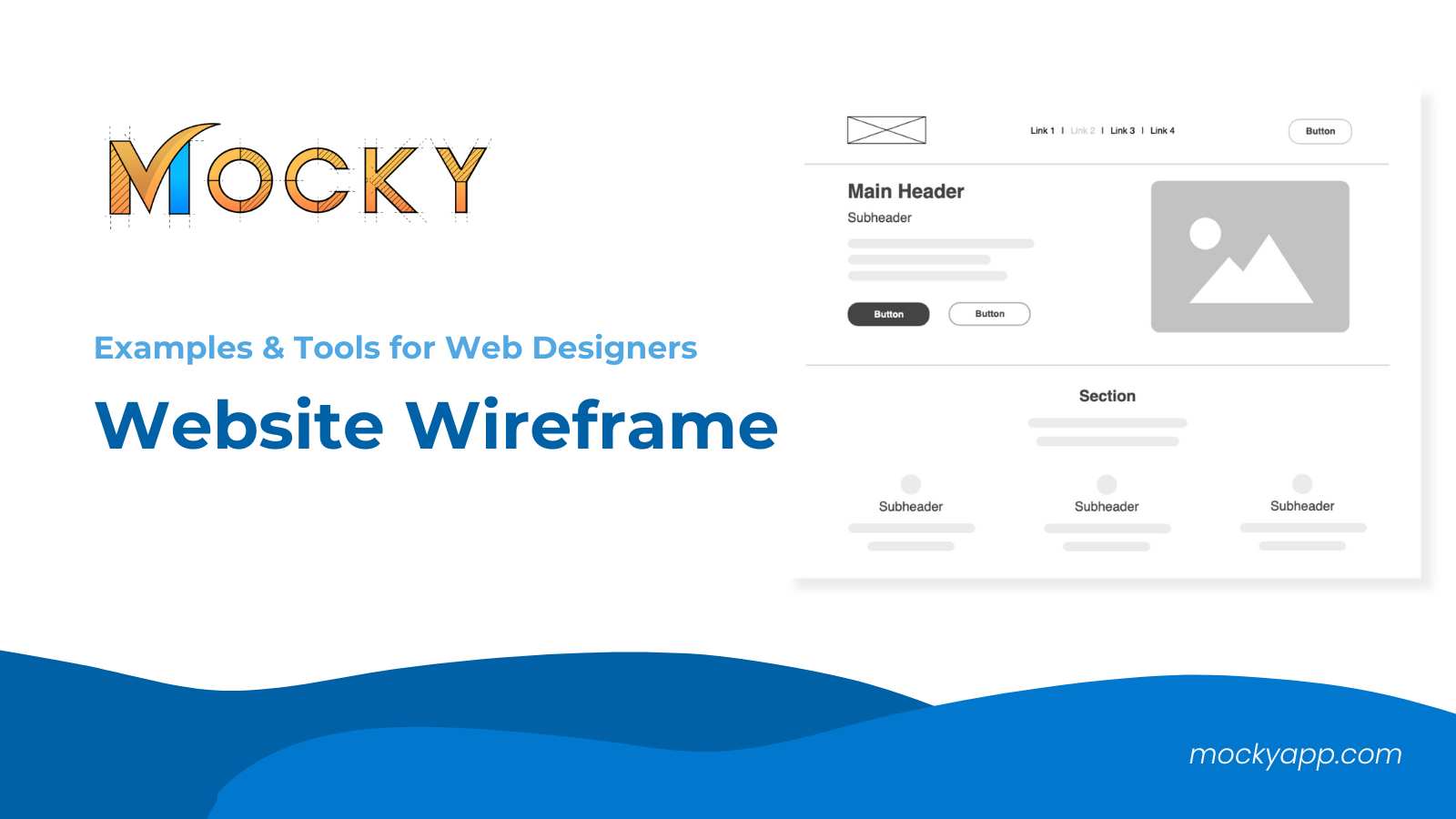
4. Low Fidelity Wrireframe
Low fidelity wireframes are essential early in the design process for mapping out the basic structure and functionality of a page without getting into detailed design elements. Here’s how to craft a simple and effective low fidelity wireframe:
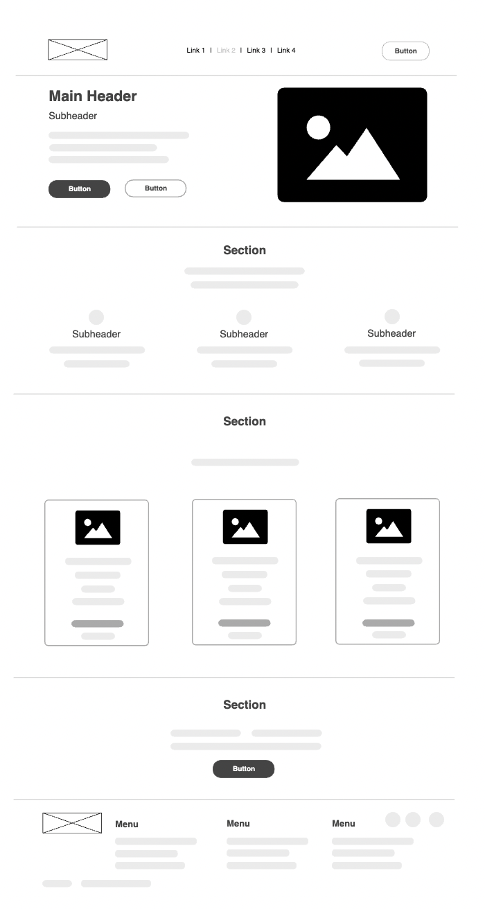
- Basic Layout:
- Blocks and Boxes: Use simple shapes to represent different parts of the page, such as headers, footers, content sections, and sidebars.
- Labels: Identify each block or box with a label to indicate what it represents (e.g., “Navigation”, “Main Content”).
- Content Placement:
- Placeholder Text: Use lines or generic text blocks to represent where text will go.
- Placeholder Images: Mark spaces for images with a crossed box or a generic icon.
- Navigation:
- Basic Navigation Links: Sketch out where the main navigation links will be placed, typically at the top or side of the page.
- Interaction Points:
- Buttons and Links: Indicate buttons with simple rectangles and label them with their function (e.g., “Submit”, “Learn More”).
- Key Features:
- Important Elements: Highlight key features or sections that need emphasis to ensure they are considered in the layout planning.
- Annotations:
- Notes and Comments: Add brief notes on functionalities or special considerations next to the relevant sections to guide further development.
5. High Fidelity Wrireframe
High fidelity wireframes are detailed blueprints of a page that include layout, content, and functionality specifics, closely resembling the final product. They are crucial for visualizing and testing the user experience before actual development begins. Here’s how to create an effective high fidelity wireframe:
- Detailed Layout:
- Accurate Sizing and Spacing: Ensure that all elements are sized and spaced according to the intended final design.
- Typography: Include font styles, weights, and sizes to give a clear sense of the textual content’s hierarchy and readability.
- Enhanced Content Representation:
- Real Content: Use actual text instead of placeholder text where possible to see how real content fits and flows in the layout.
- High-Quality Images: Incorporate detailed images or accurate placeholders to assess visual impact and spacing.
- Functional Elements:
- Interactive Components: Detail elements like dropdowns, hover effects, and sliders to understand their behavior in the user interface.
- Navigation Details: Fully design the navigation including active states and dropdown menus to test usability.
- Annotations and Specifications:
- Color Schemes: Apply color to elements to evaluate visual appeal and accessibility.
- Technical Notes: Include specific instructions or constraints for developers, such as responsive breakpoints or special effects.
- User Interaction:
- Clickable Prototypes: Turn the wireframe into a clickable prototype if possible, allowing for testing of navigation and user flows in a near-real environment.
- Feedback and Revision Areas:
- Comment Sections: Designate areas for team feedback to gather insights and iterate on the design before coding begins.
6. Story Structure
A Story Structure wireframe is essential for designing narrative-driven content, such as interactive stories, educational websites, or games. Here’s a streamlined approach to setting up this type of wireframe:
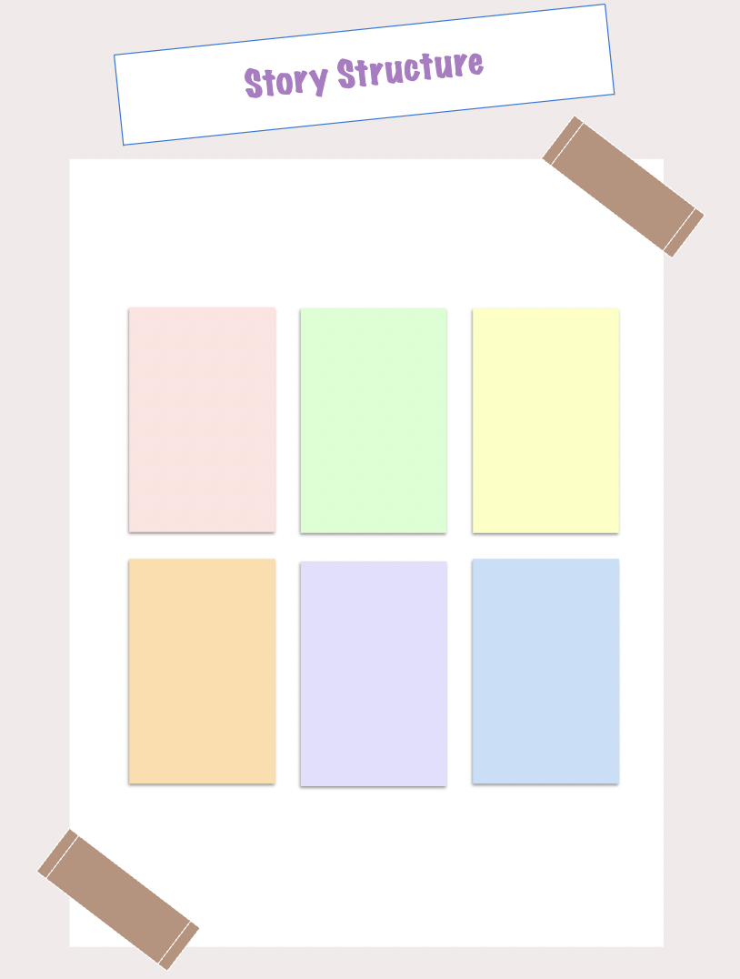
- Narrative Flow:
- Introduction: Sketch out the opening scene or introduction to set the stage.
- Development: Detail key plot points or educational segments that progress the narrative or learning objectives.
- Conclusion: Define the end of the story or summary, ensuring a clear and satisfying resolution.
- Interactive Elements:
- Decision Points: Include choices that allow users to influence the story’s path.
- Engagement Tools: Plan for quizzes, clickable elements, or other interactive features to maintain user interest.
- Content Layout:
- Text Blocks: Arrange where narrative text will be displayed.
- Media: Position images, videos, or animations that support or enhance the story.
- Navigation:
- Progress Indicators: Show users their progress through the story.
- Navigation Controls: Design intuitive controls for moving through the narrative.
- Annotations:
- Notes: Provide explanations or instructions for developers and designers to ensure the story flows as intended.
7. Mailling Wireframe Bundle
A Mailing Wireframe Bundle is vital for designing varied email templates for marketing campaigns, ensuring brand consistency and adaptability. Here’s how to create an efficient bundle:
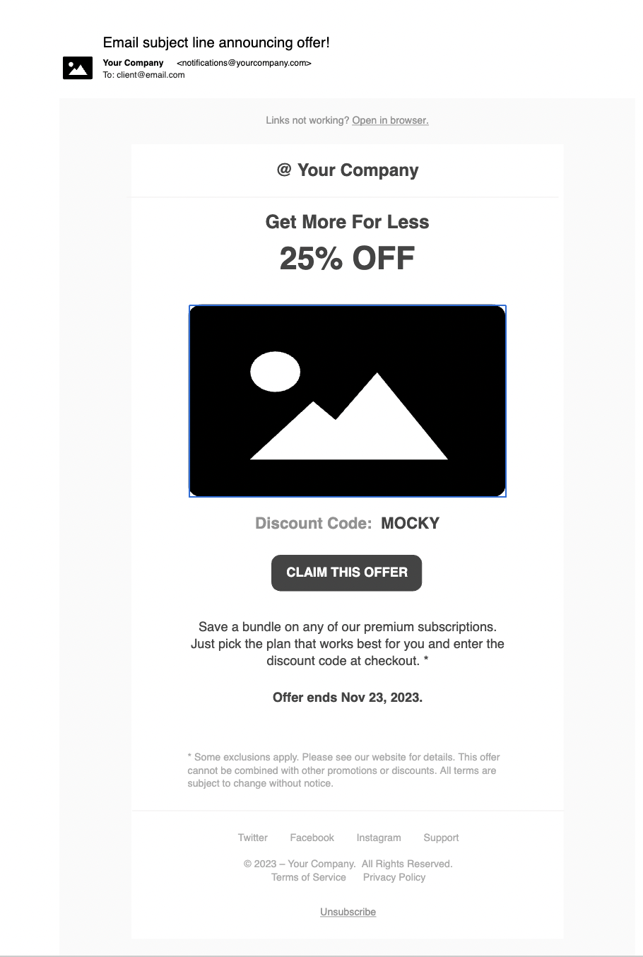
- Basic Structure:
- Header: Incorporate the company logo and a link to the main website.
- Body: Adapt layouts for specific content types—single column for newsletters and multiple columns for promotions.
- Footer: Standardize with contact info, social links, and an unsubscribe option.
- Template Variations:
- Promotional Emails: Emphasize product images and clear purchase CTAs.
- Newsletter Emails: Design for text-heavy content with occasional images or links.
- Event Announcements: Highlight event details and a prominent registration CTA.
- Engagement Features:
- CTAs: Place actionable prompts effectively within the content.
- Social Sharing: Include buttons for easy content sharing on social platforms.
- Design Elements:
- Visuals and Typography: Choose brand-consistent, high-quality visuals and readable fonts.
- Responsive Design:
- Ensure all templates perform well on both desktop and mobile devices.
- Annotations:
- Provide guidance on content placement and template use.
8. Gantt Chart
A Gantt Chart wireframe is a visual tool used to schedule and track different stages of a project. It helps project managers and teams see deadlines, dependencies, and current status of tasks. Here’s how to set up a clear and functional Gantt Chart wireframe:
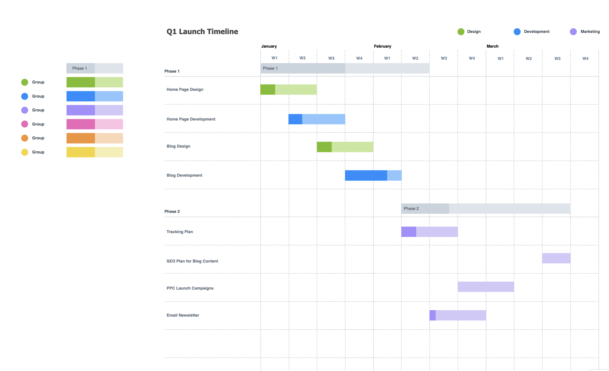
- Header:
- Project Name: Display prominently at the top.
- Time Range: Indicate the duration of the project, from start to finish.
- Chart Area:
- Task List: List all project tasks on the left side, organized by phases or departments.
- Timeline: Across the top, show time units (days, weeks, months) that correspond to the duration of the project.
- Bars: Each task has a horizontal bar that spans from its start to end date, color-coded to indicate different stages (e.g., planning, execution, review).
- Dependency Lines:
- Lines or Arrows: Show dependencies between tasks, indicating which tasks must be completed before others can start.
- Progress Indicators:
- Completion Percentage: Overlay or next to each bar, indicate how much of the task has been completed.
- Navigation Controls:
- Zoom In/Out: Allow users to adjust the view for more granular details or broader overviews.
- Scroll Bars: Horizontal and vertical scroll bars to navigate through tasks and timeframes.
- Footer:
- Legend: Explain the color codes and symbols used in the chart.
- Notes: Space for additional comments or special instructions regarding the project timeline.
9. Daily Stand up Meeting
A Daily Stand-Up Meeting wireframe is designed to facilitate quick, efficient, and focused team meetings, typically used in agile project management. Here’s how to set up a functional wireframe for these meetings:
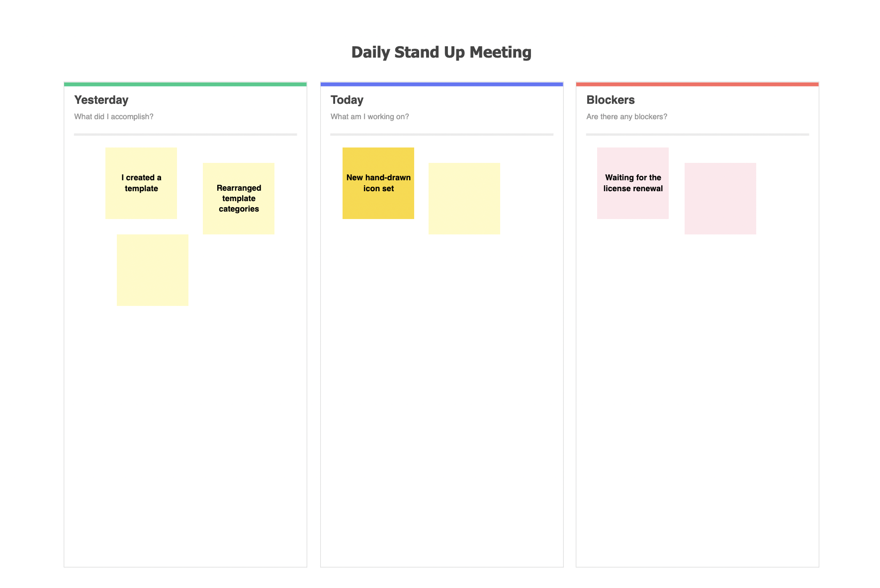
- Header:
- Project Title: Clearly display the name of the project at the top.
- Date and Time: Show the current date and time of the meeting.
- Participant List:
- Team Members: List all participants with a small placeholder for their photo or initials.
- Status Indicator: Include a color-coded status next to each name to indicate if they are speaking, waiting, or have finished their update.
- Meeting Agenda:
- Three Key Questions: Allocate sections for each participant to briefly address what they did yesterday, what they will do today, and any blockers they are facing.
- Timer:
- Countdown Clock: Display a timer to keep each participant’s update brief and on point, typically around 2 minutes.
- Action Items:
- List Area: Provide space for jotting down any action items or follow-ups that arise during the meeting.
- Navigation Controls:
- Next/Previous: Buttons to navigate between different team members’ updates.
- End Meeting: A button to conclude the session once all updates are completed.
- Footer:
- Notes: Include a section for additional notes or comments that may not directly relate to the daily updates but are pertinent to the project.
10. Scenario Mapping
Scenario Mapping is a visual tool used to outline various user interactions with a product or service, predicting possible outcomes and planning responses. This wireframe helps in designing and testing user experience paths. Here’s how to structure an effective Scenario Mapping wireframe:
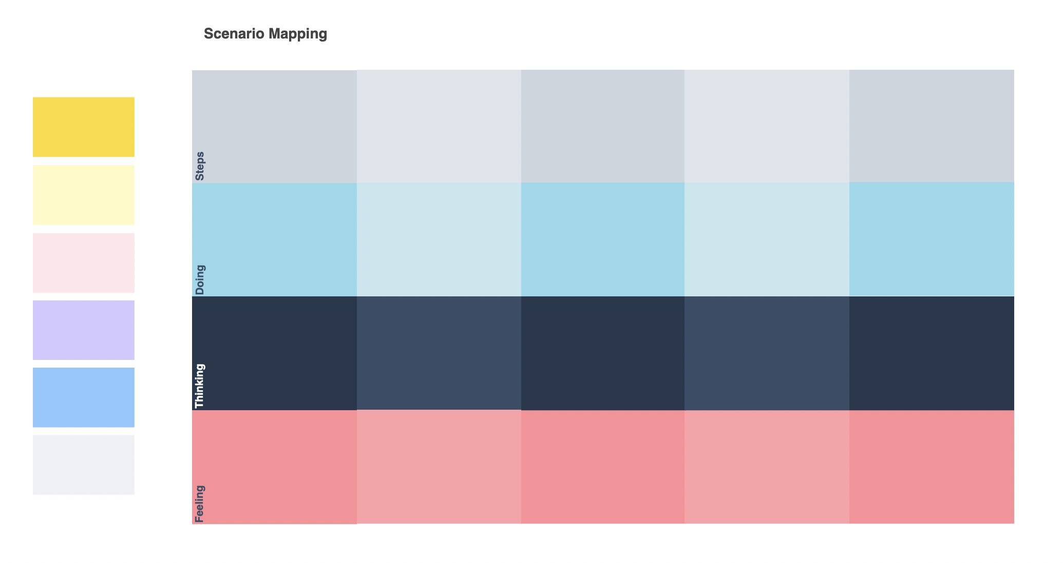
- Header:
- Project Name: Clearly display the project or product name.
- Overview: Brief description of the scenario being mapped.
- Scenario Flow:
- Start Point: Indicate the beginning of the user interaction, typically with a user action or decision.
- Decision Nodes: Mark key decision points in the flow where users choose between different actions or paths.
- Paths: Draw lines connecting decision nodes to subsequent actions and outcomes, showing the flow of interactions.
- Outcome Areas:
- End Points: Highlight possible outcomes based on user decisions, such as completing a task, reaching a goal, or encountering an error.
- Feedback Loops: Include loops where users may return to previous steps based on specific inputs or actions.
- Annotations:
- Details on Interactions: Provide notes next to each node or path explaining the interaction, decision criteria, or outcome details.
- User Emotions: Optionally, annotate emotional responses expected from the user at various points in the scenario.
- Navigation Controls:
- Zoom In/Out: Allow users to zoom in for detailed views or out to see the whole scenario.
- Pan: Enable panning across the map for large scenarios.
- Footer:
- Legend: Define the symbols and colors used in the map for easy reference.
- Modification Date: Note when the last updates were made to the scenario map.
11. One on One Meeting
A One on One Meeting wireframe is designed to optimize the structure and flow of personal meetings between a manager and an employee. This tool helps ensure that the meeting covers all necessary topics efficiently while providing space for open dialogue. Here’s how to design a functional wireframe for these meetings
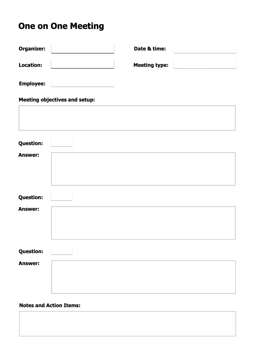
- Header:
- Meeting Title: Clearly state the purpose, such as “Monthly One-on-One Review”.
- Participants: List names of the manager and employee.
- Date and Time: Display when the meeting is scheduled.
- Agenda Overview:
- Key Topics: Sectioned areas for each main discussion point, such as Performance Review, Goal Setting, and Feedback.
- Time Allocations: Indicate expected time slots for each topic to keep the meeting on track.
- Discussion Points:
- Employee Update: Space for the employee to list achievements, challenges, or points they wish to discuss.
- Manager Feedback: Area for the manager to provide constructive feedback and recognition.
- Goals and Planning:
- Future Objectives: Set areas to outline goals for the next period.
- Action Items: Note any agreed-upon actions or tasks to be undertaken by the employee or manager.
- Feedback Section:
- Open Discussion: Allocate a flexible space for open-ended conversation to address any additional topics or concerns.
- Summary and Next Steps:
- Meeting Recap: Brief summary of discussions and decisions made.
- Next Meeting: Schedule the next one-on-one meeting.
- Footer:
- Notes: Space for any extra notes either party may want to jot down post-meeting.
12. Kanban Board
A Kanban Board wireframe is a crucial tool in agile project management, designed to visualize work, maximize efficiency, and optimize the flow of tasks. Here’s how to structure a Kanban Board wireframe effectively:
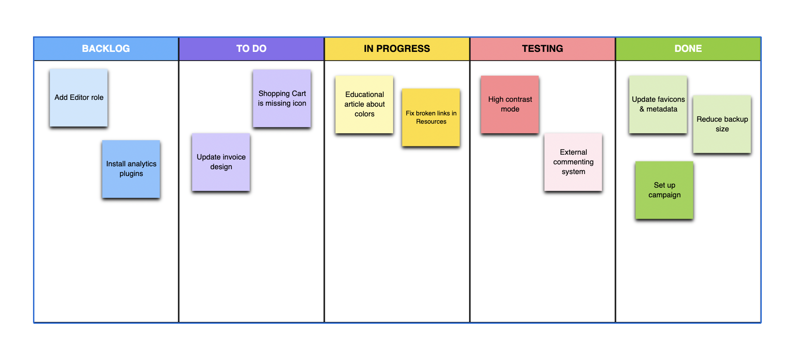
- Header:
- Board Name: Display the project or team name prominently.
- Project Overview: Optional section to provide a brief description of the project’s goals.
- Columns:
- To Do: List all tasks that need to be started. Tasks are typically represented as cards.
- In Progress: Tasks that are currently being worked on.
- Review: Tasks awaiting approval or review from peers or supervisors.
- Done: Completed tasks.
- Task Cards:
- Title: Short description of the task.
- Assignee: The person responsible for the task.
- Due Date: When the task needs to be completed.
- Priority Indicator: Color-coded or labeled to show task urgency.
- Navigation Controls:
- Add Task: Button to create new task cards.
- Filter Options: Tools to filter tasks by assignee, priority, or status.
- Search Bar: To quickly find specific tasks or projects.
- Activity Log:
- Recent Changes: List recent updates to tasks or column changes to keep team members informed.
- Footer:
- Team Members: List of all project participants with quick links to their profiles or contact information.
- Project Milestones: Upcoming important dates or deadlines.
13. Weekly Calendar
A Weekly Calendar wireframe is designed to help users effectively plan and view their activities over the course of a week. It’s particularly useful in personal and professional settings where time management is crucial. Here’s how to set up a functional Weekly Calendar wireframe:
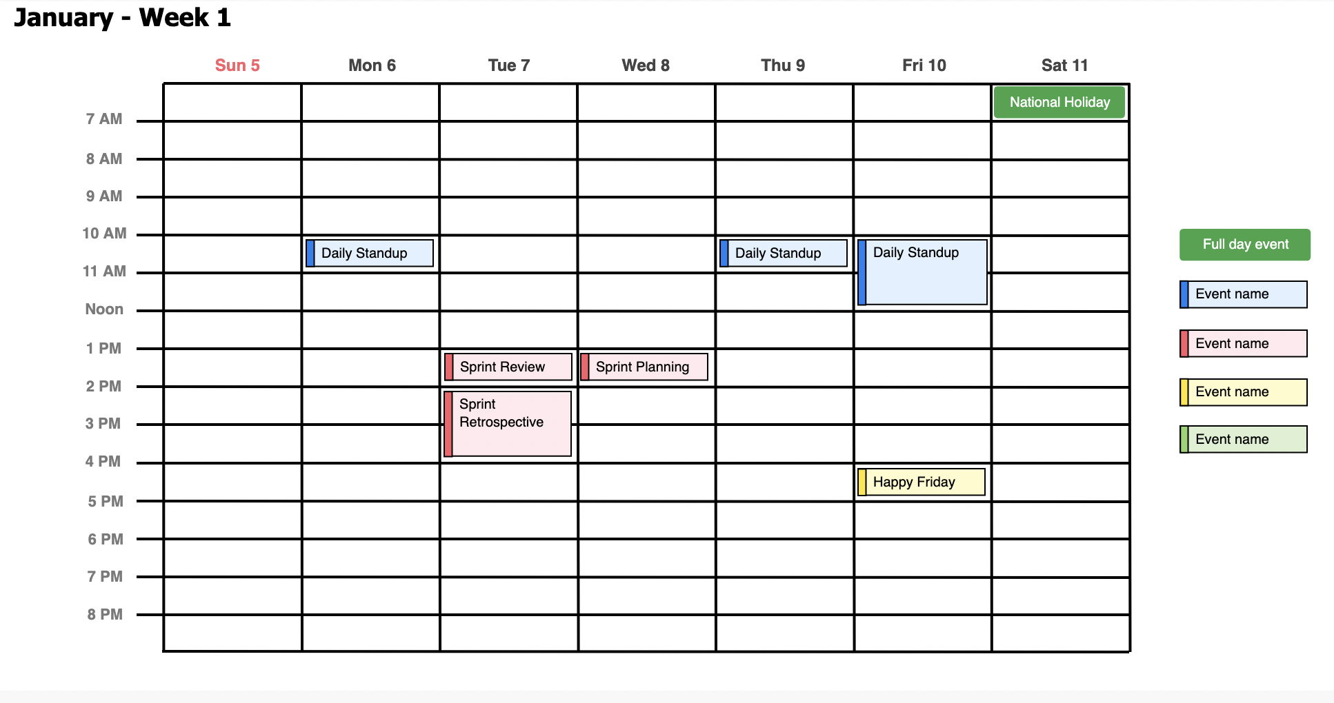
- Header:
- Calendar Name: Typically the user’s name or the team’s name if shared.
- Current Week: Display the range of dates for the current week.
- Days Columns:
- Monday through Sunday: Each day of the week is represented as a column.
- Date Labels: Label each column with the date for clarity.
- Time Slots:
- Hourly Blocks: Divide each day into hourly segments or blocks tailored to the user’s schedule, starting from the earliest to the latest possible appointments.
- All-Day Events Section: At the top of each column, provide space for events that span the entire day.
- Event Details:
- Event Name: Each time slot can contain an event name.
- Location: Include a space for event location to aid logistical planning.
- Color Coding: Use different colors to categorize types of activities (e.g., work, personal, important meetings).
- Interactive Features:
- Add Event Button: Allow users to easily add new events to the calendar.
- Edit and Delete Functions: Enable modifying or removing existing events.
14. User Persona
A User Persona wireframe is a tool used in user-centered design to represent a detailed profile of a hypothetical user based on research and real data. This profile helps designers and developers understand the user’s needs, experiences, behaviors, and goals. Here’s how to design a User Persona wireframe effectively:
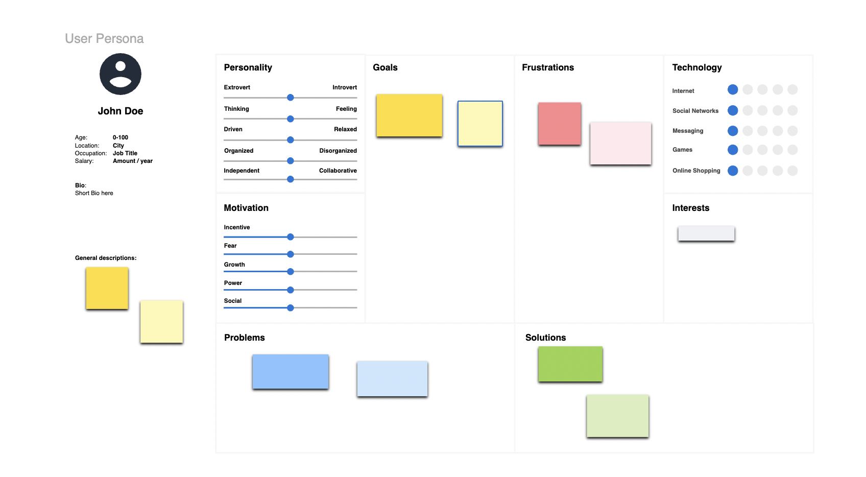
- Header:
- Persona Name: Give the persona a fictitious name to personalize the profile.
- Photo: Include a representative image to help visualize the persona.
- Demographic Information:
- Age: Specify the persona’s age.
- Occupation: Detail the persona’s job and major responsibilities.
- Location: Indicate where the persona lives.
- Bio:
- Background: Briefly describe the persona’s background, education, and any relevant history.
- Narrative: A short narrative to provide a deeper understanding of the persona’s daily life and how they interact with the product.
- User Needs and Goals:
- Primary Goals: List the main objectives the persona aims to achieve with the product.
- Secondary Goals: Note additional goals that could influence their behavior.
- Pain Points:
- Challenges: Identify obstacles or frustrations the persona encounters in achieving their goals.
- Technology Usage:
- Devices: List the devices the persona commonly uses (e.g., smartphone, laptop).
- Software Preferences: Mention the software or apps that the persona prefers.
- Psychographics:
- Personality Traits: Describe attributes like introverted, detail-oriented, etc.
- Lifestyle: Provide insight into the persona’s lifestyle choices and habits.
- Scenario of Use:
- Interaction with Product: Describe a typical scenario in which the persona uses the product, highlighting touchpoints and decision-making processes.
- Footer:
- Quotes: Include direct quotes from research that reflect the persona’s attitudes or comments about the product.
- Notes: Space for additional comments or observations.
15. MoodBoard
A Mood Board wireframe is a visual tool used in design and creative projects to communicate the aesthetic feel, color scheme, and thematic elements of a project. It helps teams and clients align on the visual direction before detailed designs are developed. Here’s how to craft an effective Mood Board wireframe:
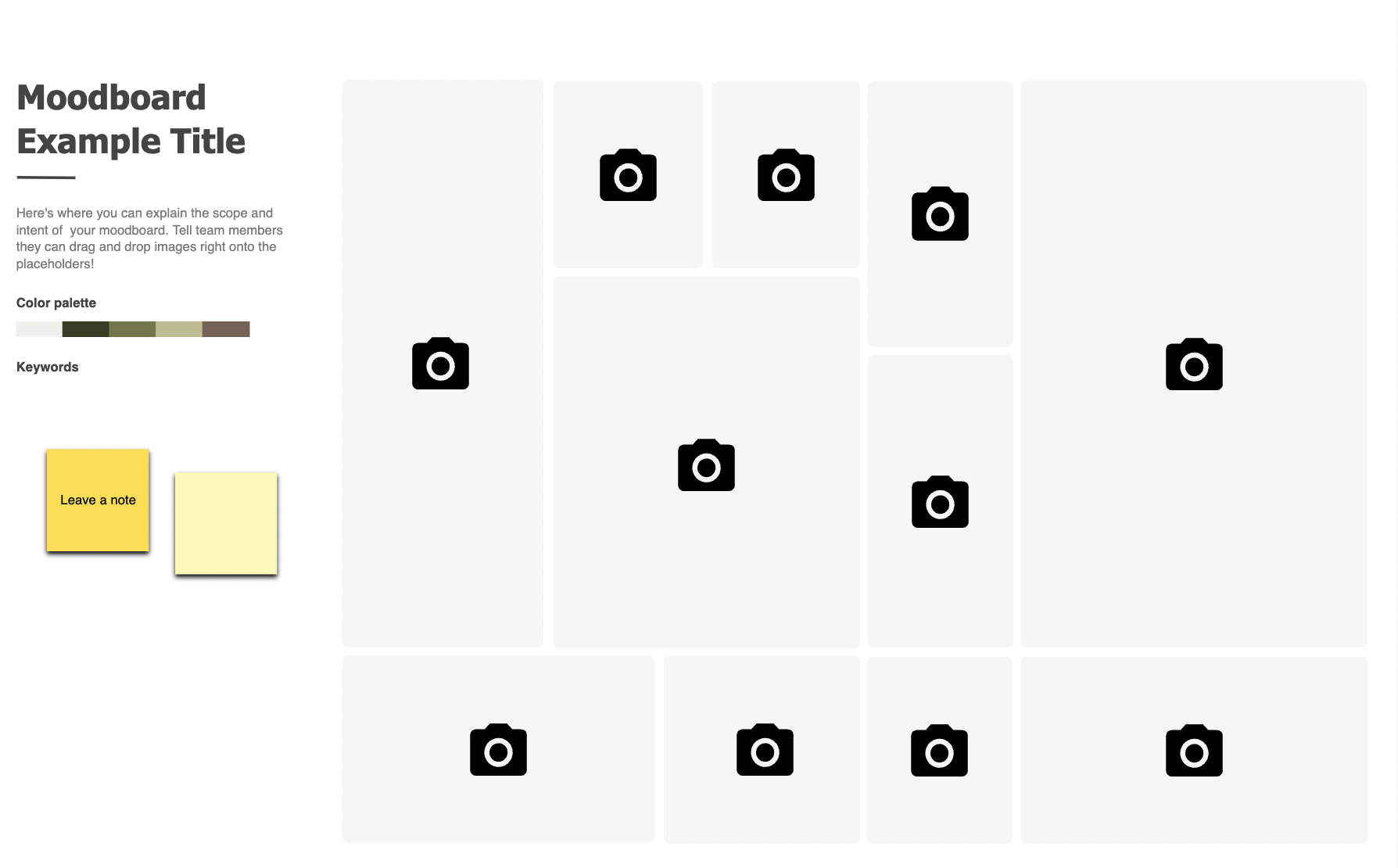
- Header:
- Project Title: Clearly state the name of the project or theme.
- Date: Include the creation date for reference.
- Image Areas:
- Visual Inspirations: Allocate large sections for images that capture the project’s mood, such as textures, colors, and photographs.
- Color Palette: Display a section dedicated to the primary and secondary colors, including swatches.
- Textiles and Materials: Show samples or images of any materials relevant to the project.
- Typography Samples:
- Font Styles: Include examples of typography that match the mood board’s theme, showing how text elements might look in the final design.
- Inspirational Quotes or Keywords:
- Descriptive Words: Add short, impactful words or phrases that encapsulate the mood or theme (e.g., “serene”, “bold”, “innovative”).
- Design Elements:
- Patterns and Icons: Incorporate sections for any patterns, icons, or graphical elements that contribute to the aesthetic.
- Layout and Flow:
- Arrangement: Organize elements in a visually pleasing manner that logically flows, allowing viewers to easily understand the visual story.
- Interactive Features:
- Comments Section: Include a space for team members or clients to add their feedback directly on the wireframe.
16. Stakeholder Mapping
Stakeholder Mapping is essential for visualizing the influence and interest of different groups affecting a project. Here’s how to create a straightforward Stakeholder Mapping wireframe:
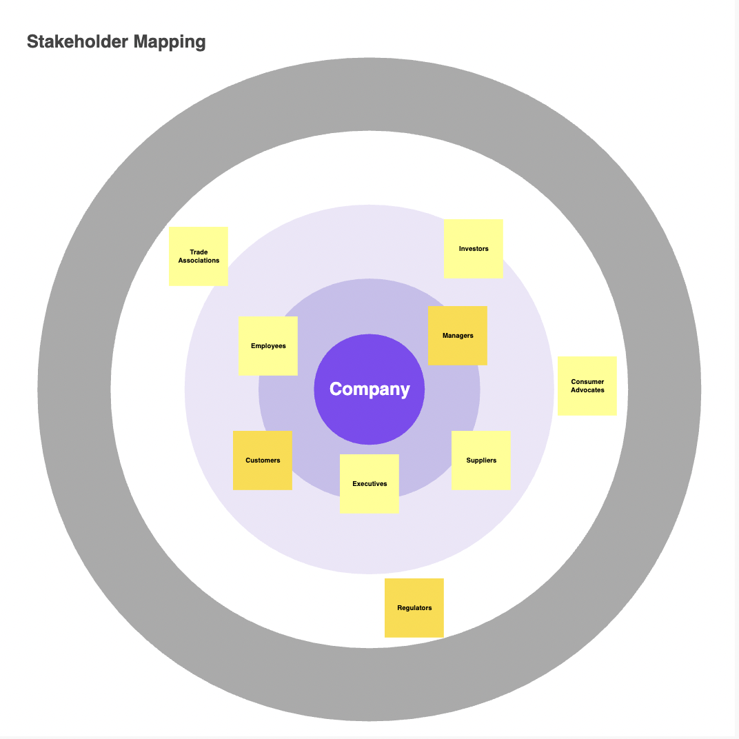
- Header:
- Project Name and Date: Clearly display at the top for easy reference.
- Stakeholder Categories:
- Internal vs. External: Differentiate between company stakeholders and outside entities.
- Influence and Interest Levels: Classify stakeholders by their influence (high, medium, low) and interest (high, low) in the project.
- Mapping Area:
- Visual Grid: Place stakeholders within a grid based on their influence and interest.
- Icons: Use icons to represent different groups for clarity.
- Engagement Strategies:
- Active Engagement: Detail engagement tactics for high-influence, high-interest stakeholders.
- Information Sharing: Outline communication methods for stakeholders with high interest but lower influence.
- Influence Boosting: Suggest strategies to engage high-influence, low-interest stakeholders.
- Notes Section:
- Stakeholder Insights: Brief notes on stakeholder expectations and potential impact.
- Communication Tips: Quick tips for interacting with each stakeholder group.
- Interactive Features:
- Filters and Editing: Tools to filter stakeholders and edit their details directly on the wireframe.
- Footer:
- Revision History and Contact Info: Keep track of updates and provide essential contact information.
17. Product Develop Roadmap
A Product Development Roadmap wireframe is a visual guide outlining the key phases, features, and timelines for building and launching a product. Here’s a concise structure for this wireframe:
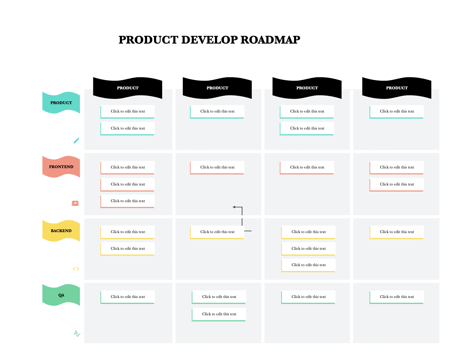
- Header:
- Product Name and Date Range: Clearly state the project title and timeframe.
- Phases and Features:
- Development Phases: List key phases such as Discovery, Planning, Development, Testing, and Launch.
- Feature Highlights: Highlight major features or deliverables for each phase.
- Timeline:
- Visual Timeline: Display a timeline with milestones and key dates.
- Dependencies and Resources:
- Connection Lines: Show dependencies between phases or features.
- Resource Allocation: Indicate team members and budget allocation for each phase.
- Risk Management:
- Identify Risks: Highlight potential risks associated with each phase.
- Mitigation Strategies: Propose strategies to address and mitigate risks.
- Interactive Features:
- Zoom and Edit Options: Enable zooming for detailed views and editing features for flexibility.
- Footer:
- Revision History and Contact Info: Track revisions and provide contact details for further discussion.
18. Coming Soon Landing Page
A Coming Soon Landing Page wireframe is a teaser for an upcoming product or service, enticing visitors to sign up for updates. Here’s a concise layout:
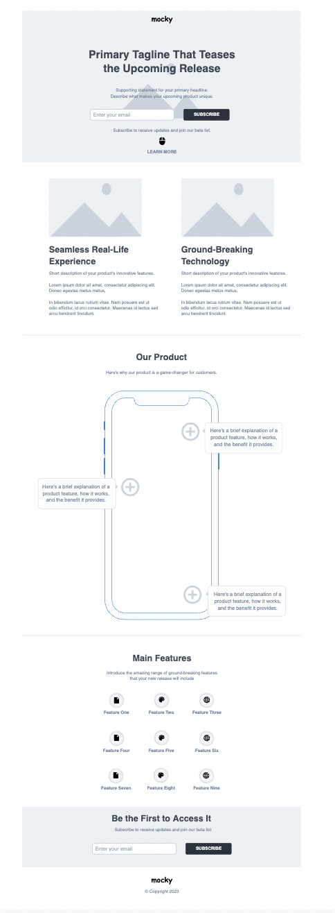
- Header:
- Logo and Headline: Company logo and catchy headline to create anticipation.
- Countdown Timer: Display a countdown to the launch date.
- Main Content:
- Product Preview: Show a glimpse of the product or service.
- Brief Description: Concise overview highlighting key benefits.
- Email Subscription: Allow visitors to sign up for updates.
- Footer:
- Copyright and Contact Info: Legal details and optional contact information.
19. User Story Mapping
A User Story Mapping wireframe is a visual tool used in Agile project management to organize and prioritize user stories based on user needs and workflow. It helps teams plan iterations and releases more effectively. Here’s a simplified structure for a User Story Mapping wireframe:
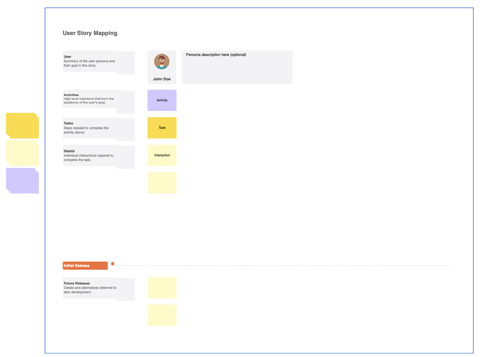
- Header:
- Project Name and Date: Clearly state the project title and the date of creation.
- User Story Columns:
- Backlog: List all user stories that need to be prioritized and planned.
- Current Iteration: Display user stories scheduled for the current iteration.
- Future Iterations: Include user stories planned for future iterations.
- User Stories:
- Story Cards: Each user story is represented as a card with a title and description.
- Priority Labels: Use labels or color-coding to indicate the priority level of each user story.
- Workflow:
- User Journey: Map out the user journey or workflow across columns, showing how user stories progress from backlog to completed.
- Interactive Features:
- Drag and Drop: Allow users to easily move user story cards between columns to prioritize and schedule.
- Filtering Options: Provide filters to view user stories by priority, assignee, or status.
- Footer:
- Revision History: Track changes made to the user story map over time.
- Contact Information: Provide contact details for project managers or stakeholders for further discussion.
20. UML Class
A UML (Unified Modeling Language) Class Diagram wireframe is a visual representation of the structure and relationships of classes in a system or application. It helps in understanding the organization of code and planning software architecture. Here’s a basic structure for a UML Class Diagram wireframe:
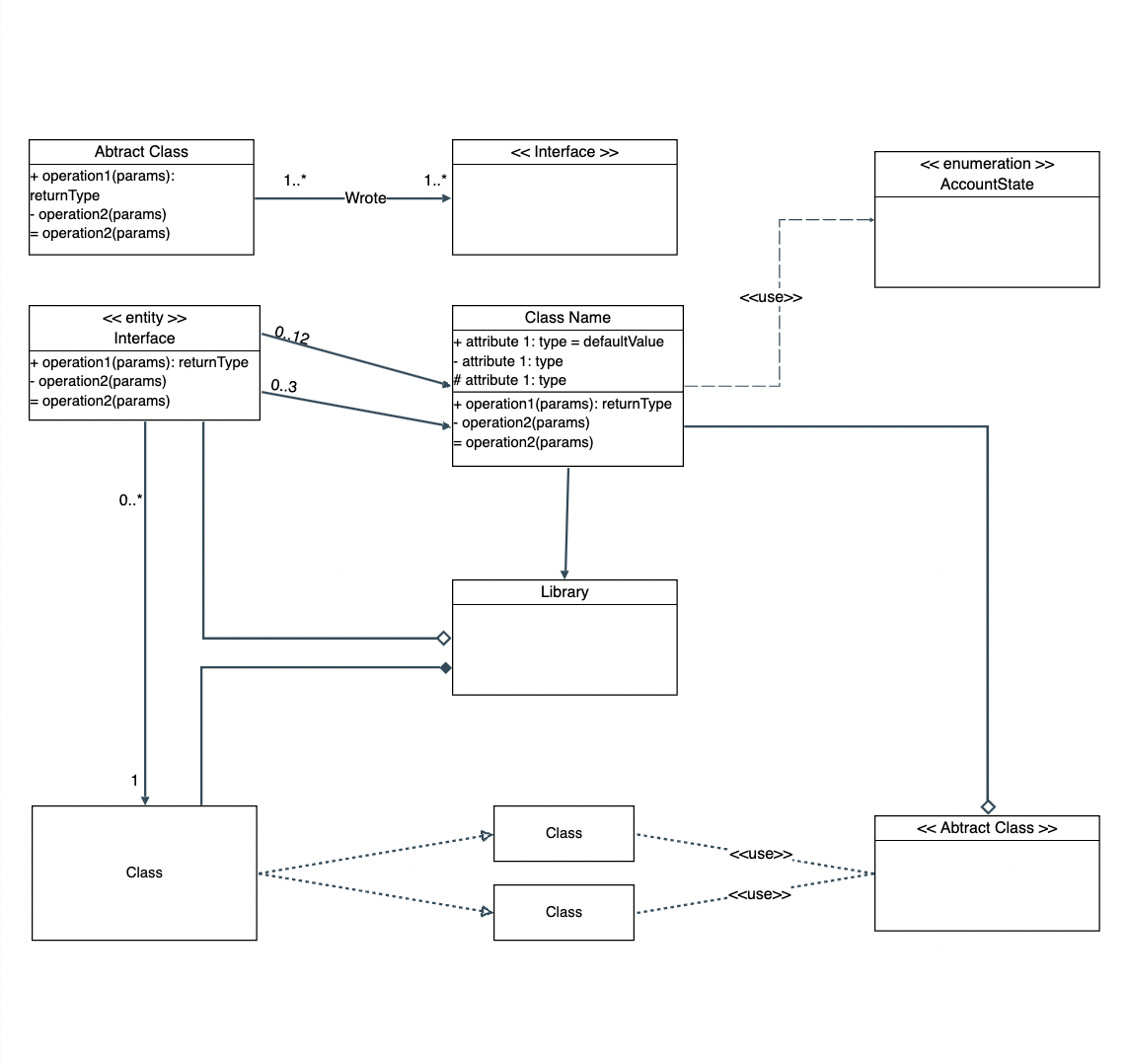
- Classes:
- Class Name: Each class is represented as a rectangle with the class name at the top.
- Attributes: List class attributes (variables) below the class name.
- Methods: Outline class methods (functions) beneath the attributes.
- Relationships:
- Inheritance: Use solid line arrows with a triangle to represent inheritance relationships between classes.
- Association: Show associations between classes with solid lines, optionally including multiplicity (e.g., 1..*).
- Aggregation/Composition: Indicate aggregation (part-of relationship) or composition (whole-part relationship) with hollow diamond or filled diamond arrows, respectively.
- Dependency: Represent dependency relationships with dashed lines between classes.
- Modifiers:
- Visibility: Prefix attributes and methods with symbols to indicate visibility (e.g., + for public, – for private).
- Static/Instance: Optionally, use underlines to denote static members.
- Interactive Features:
- Zoom and Pan Controls: Enable zooming for detailed views and panning across large diagrams.
- Edit Options: Allow for easy editing of class names, attributes, and relationships.
In wrapping up, wireframes are indispensable tools for visualizing design concepts and streamlining the development process. In this blog, we’ve covered a wide array of wireframe examples, illustrating their versatility across different industries and projects.
By showcasing how to create wireframes using Confluence, a popular collaboration platform, we’ve empowered readers to leverage familiar tools for efficient design collaboration.
Incorporating wireframing into your design process enhances communication, clarifies requirements, and fosters iteration for better outcomes. Whether you’re a seasoned designer or just starting out, wireframes are key to delivering user-centric solutions effectively.
Related Blogs:
- 5 must-try webpage wireframe tools for Confluence in 2024
- 10 Best Practices for Maintaining UI Wireframe Documentation